Designing a Website Built for Alaskan Exploration
Overview
I designed an airline website experience built around the unique way light aircraft connect communities across Alaska. Alongside the website, I created a full design system to ensure consistent visuals, components, and interactions throughout the product.
Challenges
Interfaces Stuck in the Past
01
Many light aircraft airline websites still rely on outdated interfaces that feel cluttered, slow, and difficult to navigate. This makes it hard for travelers to quickly find flights, routes, or important information they need.
"The challenge is to design a web platform that embodies Alaska's unique character and landscape without compromising user experience or accessibility standards."
Project Goals

Modernize the booking experience.

Create a unified design system

Improve clarity and trust for travelers.

Building an Experience that Represents the beauty of Alaska
To improve the booking experience and build trust with travelers, I created a design system called Aurora. It unifies and streamlines the entire Air Tundra experience, bringing clarity and consistency to every touchpoint.

Final Design
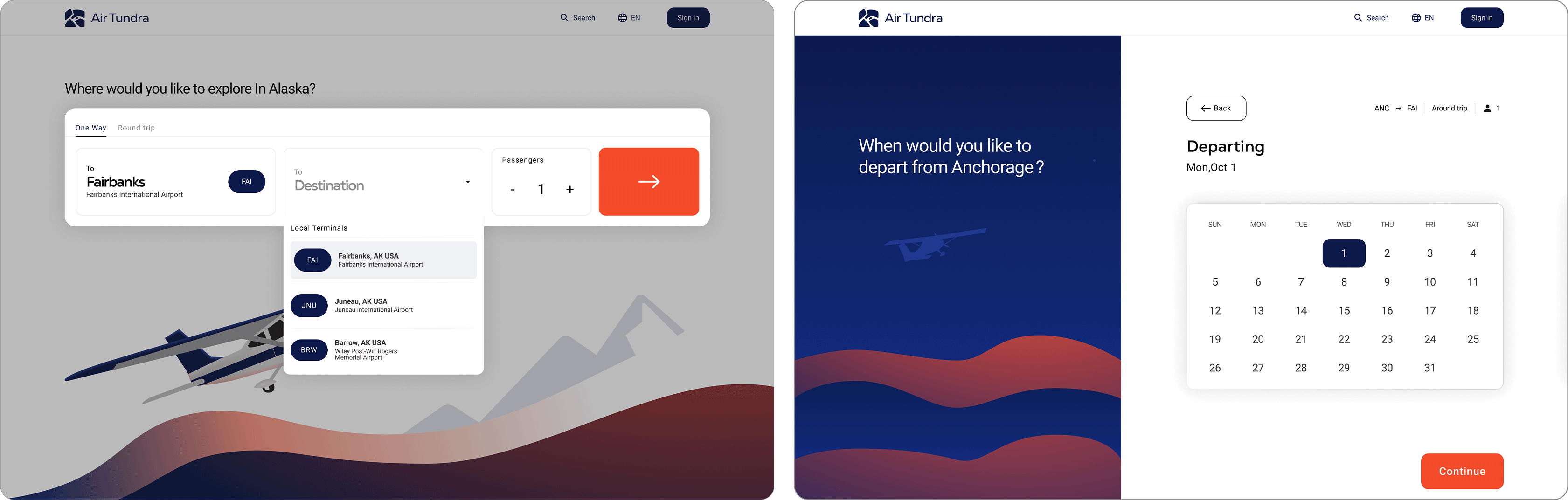
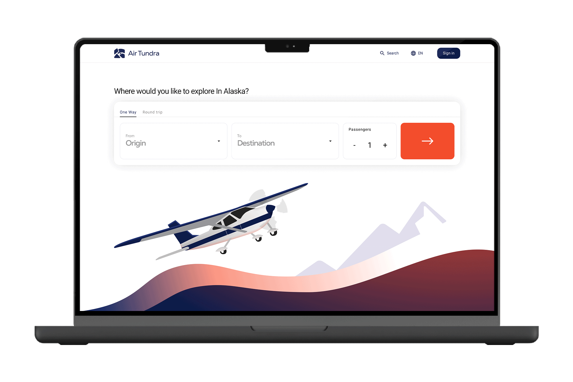
Picking Your Destination & Time
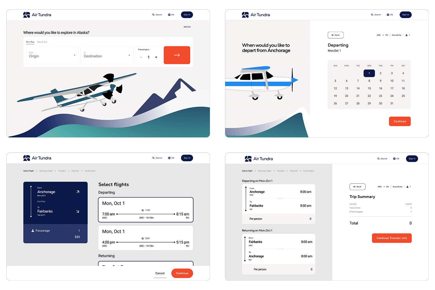
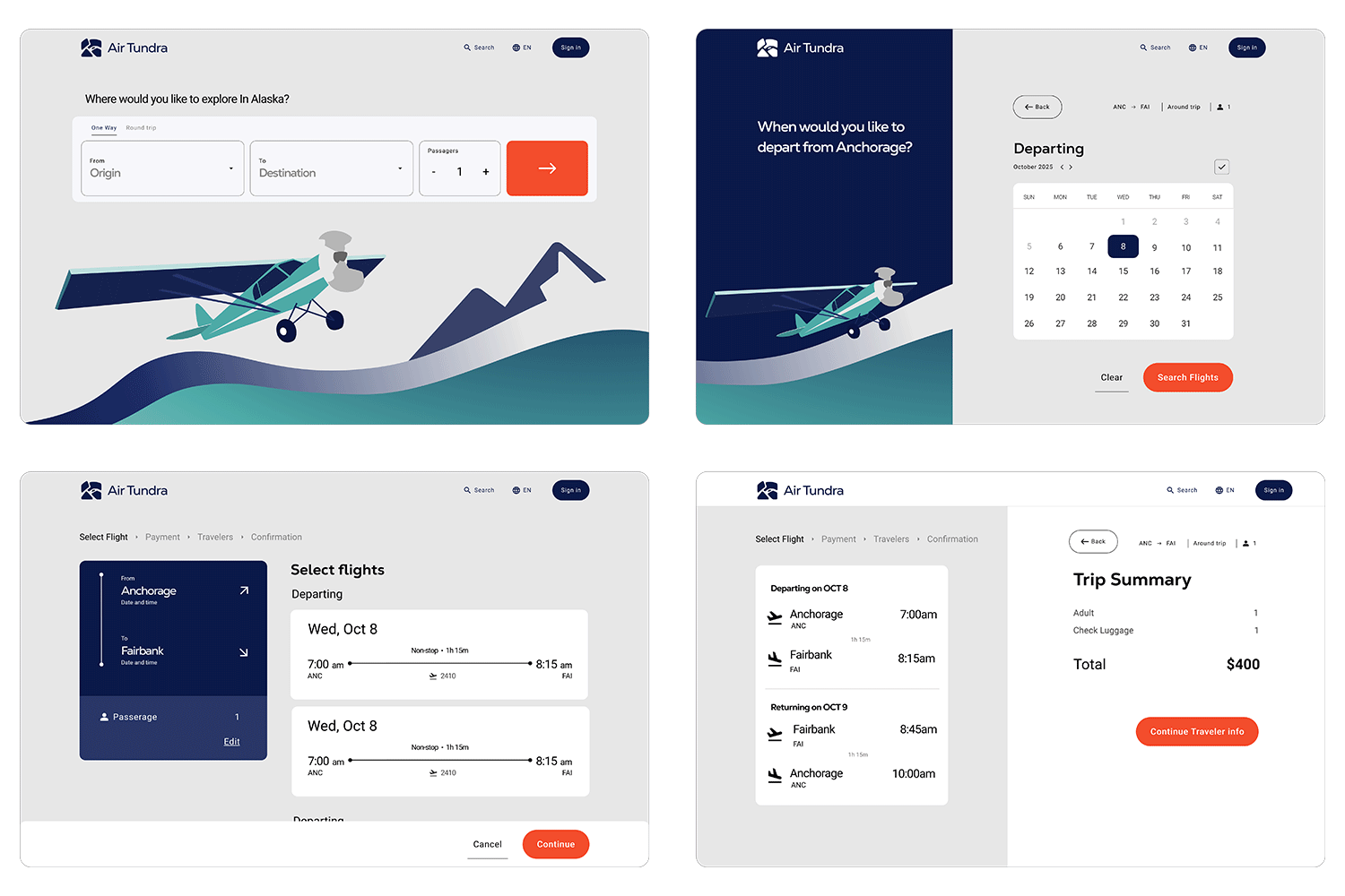
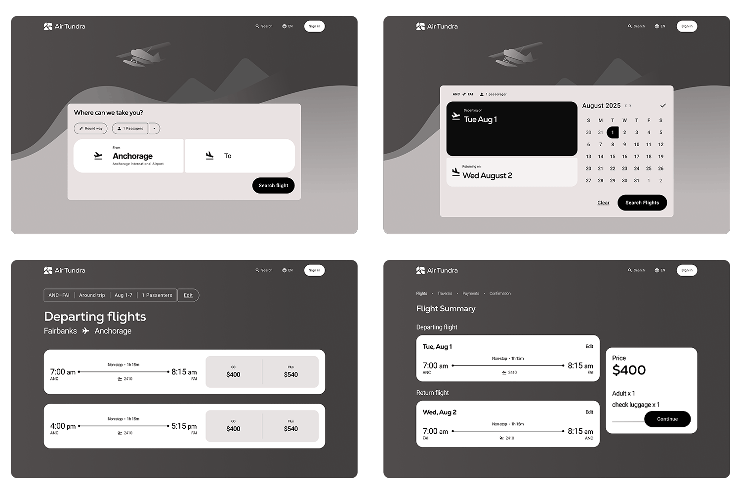
01
On the homepage, users can choose their origin and destination through two simple drop downs showcasing city airports. They can also select the number of passengers before starting their flight search.
02
The next page takes users to a screen where they can choose their departing and returning flights.
Final Design
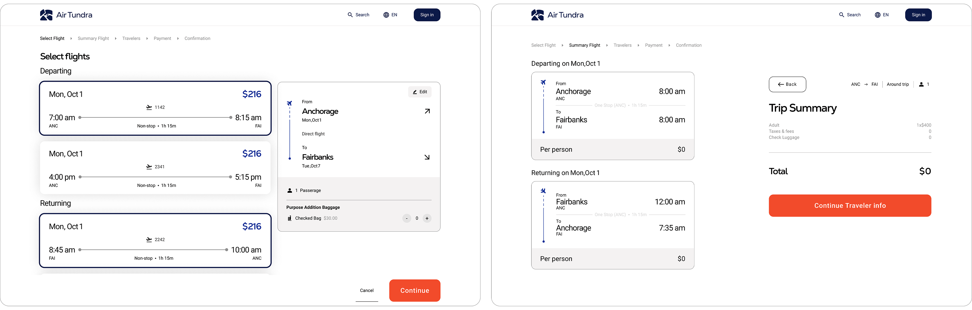
Selecting flights & Transparent info.
01
On the left will cards showcasing all flights that user have option for the day they pick. On the right show a card displaying the destination information.
02
The next page shows a summary of the flights selected for the trip. It also displays the total price that includies amount of passengers, checked bags, and any additional fees.
Final Design
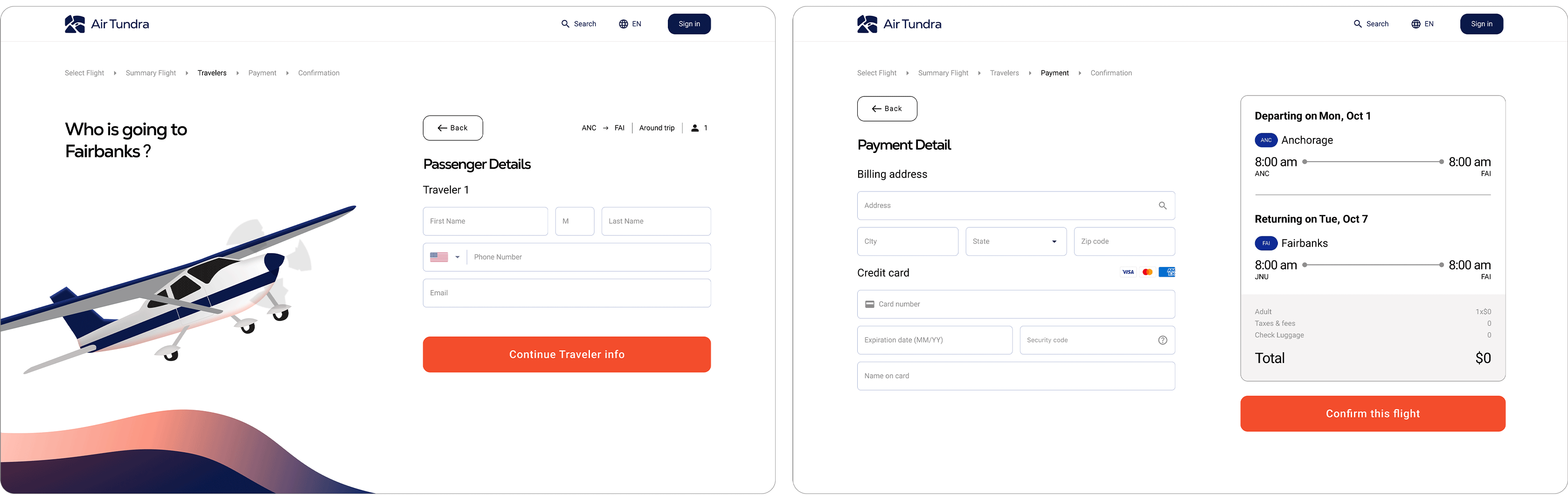
Enter Travel Personal Info.
01
After trip summary, the users will provide their personal info. like full names, number, and email.
02
After entering passenger information, the user provides their payment details. A summary on the right shows the full flight schedule and total price for the trip.
Final Design
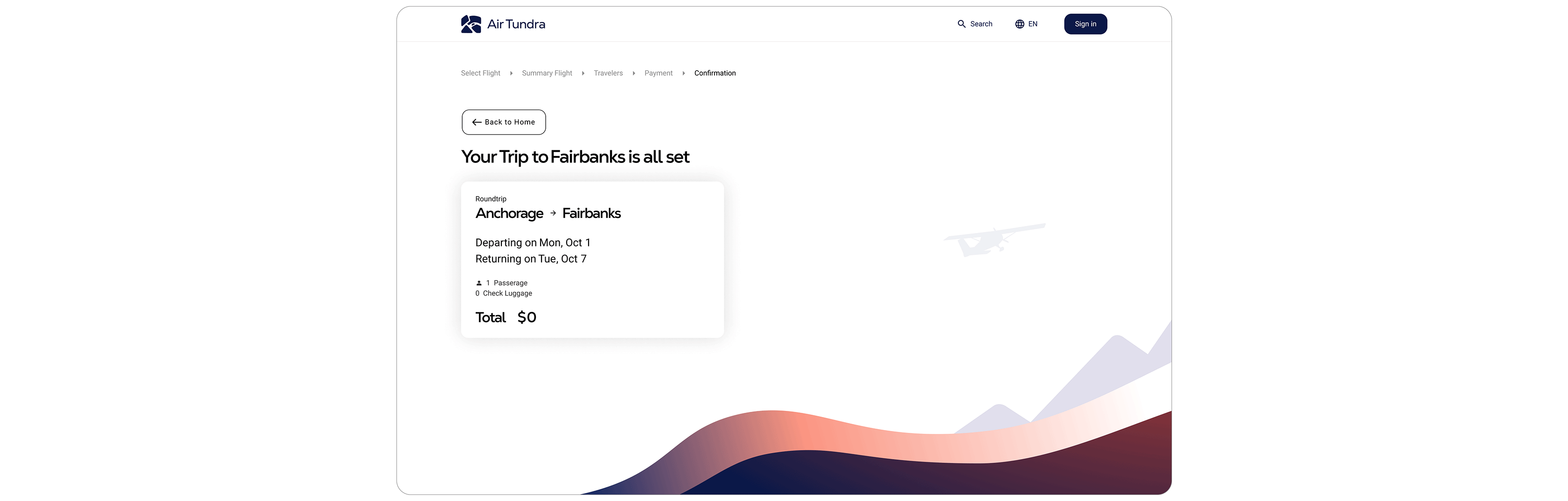
Confirmation flights
01
This page is a confirmation screen that verifies the user’s flights have been successfully booked.
Gathering Insights
I didn’t know much about the dos and don’ts of airline website experiences, so I started by researching airlines that mainly operate with light aircraft. This gave me a better understanding of common patterns, expectations, and gaps in the industry.
Core Insights

It helped me understand standard airline layouts.
It showed me how airlines use branding to build trust
I learned how booking user flows are structured.
User flow
After gaining a better understanding of airline norms, I created a streamlined booking flow that’s easy to follow and free of unnecessary steps.
The Evolution of Air Tundra branding and Layouts
The branding and layout of Air Tundra went through three major overhauls to improve the visual design, user experience, and overall hierarchy.
At this point, I have experimenting different layout to find the flow for the user.

I completely redesign the layout as they showing low visual hierarchy and look awkward. Using Illustration and color was able improve the visual layout and brand identity.
This stage was mainly refined tuning the elements spacing, color, and illustration.
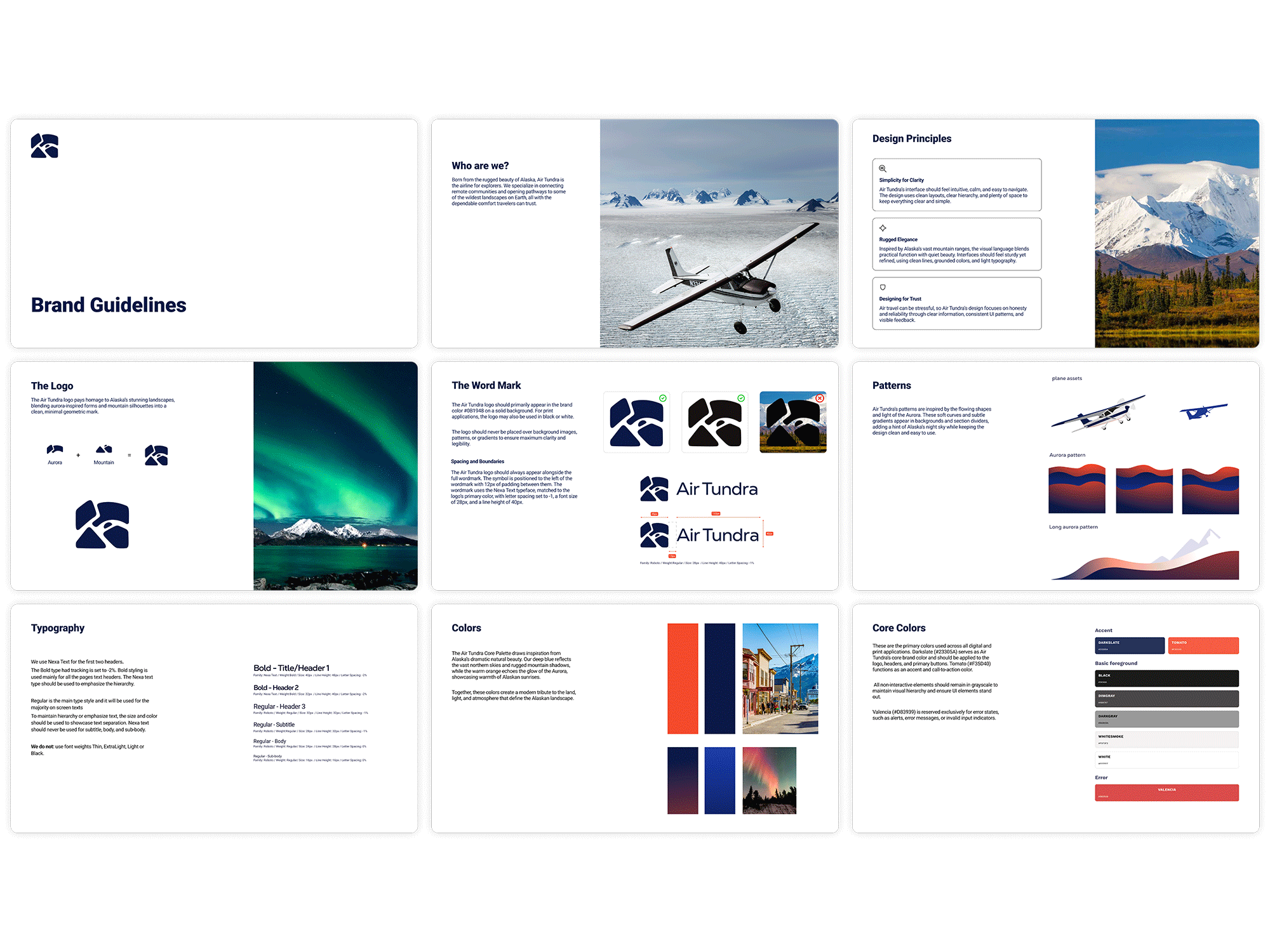
Aurora branding Guidelines
To establish Air Tundra’s brand identity, I created branding sheets that include design principles, a color palette, logo guidelines, and more. This ensures a unified and consistent brand message.
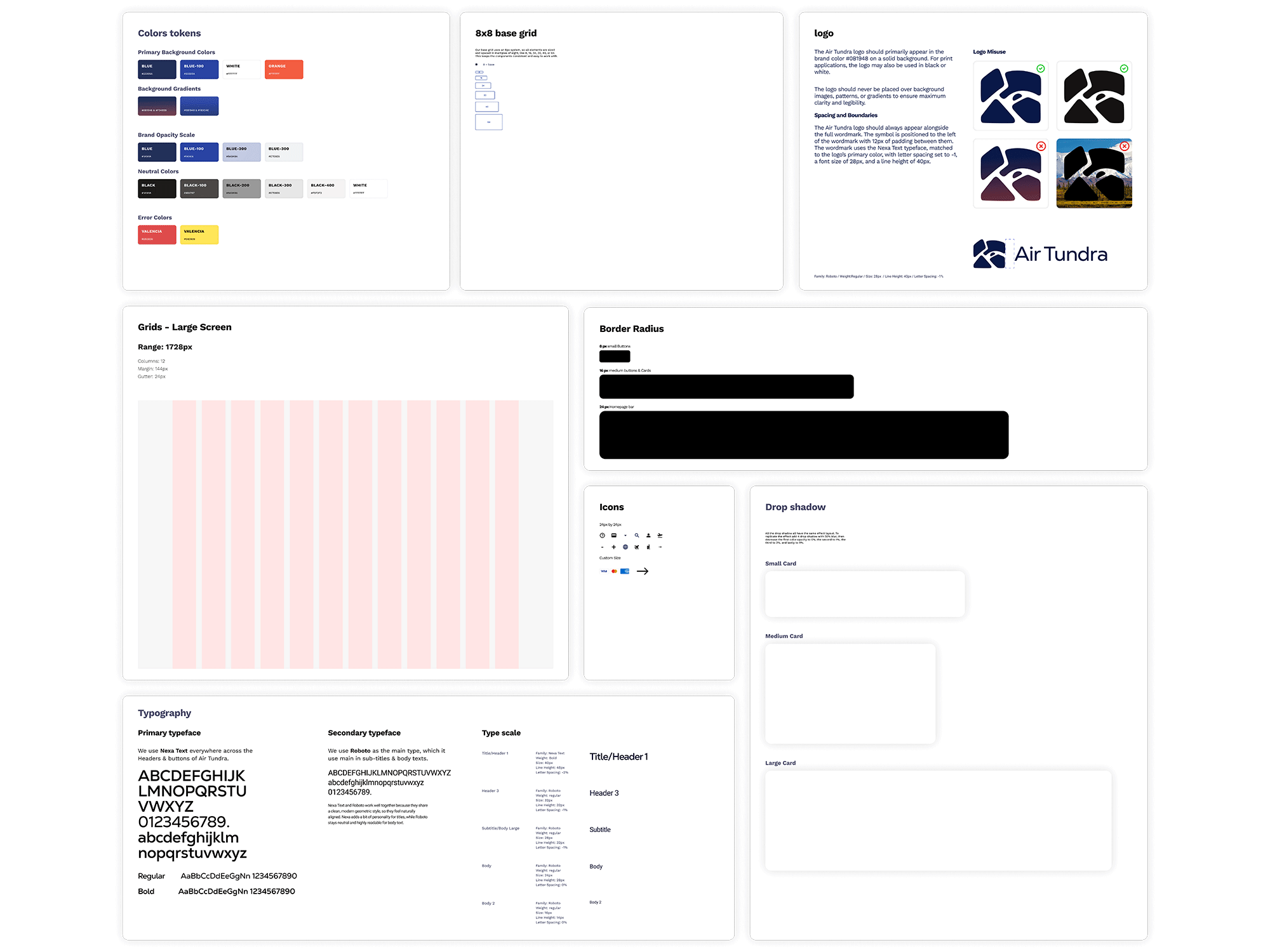
Why Created Design Token?
I created design tokens that define the core elements like color, typography, and spacing. They help keep everything consistent and make the design easier to maintain across the whole project.
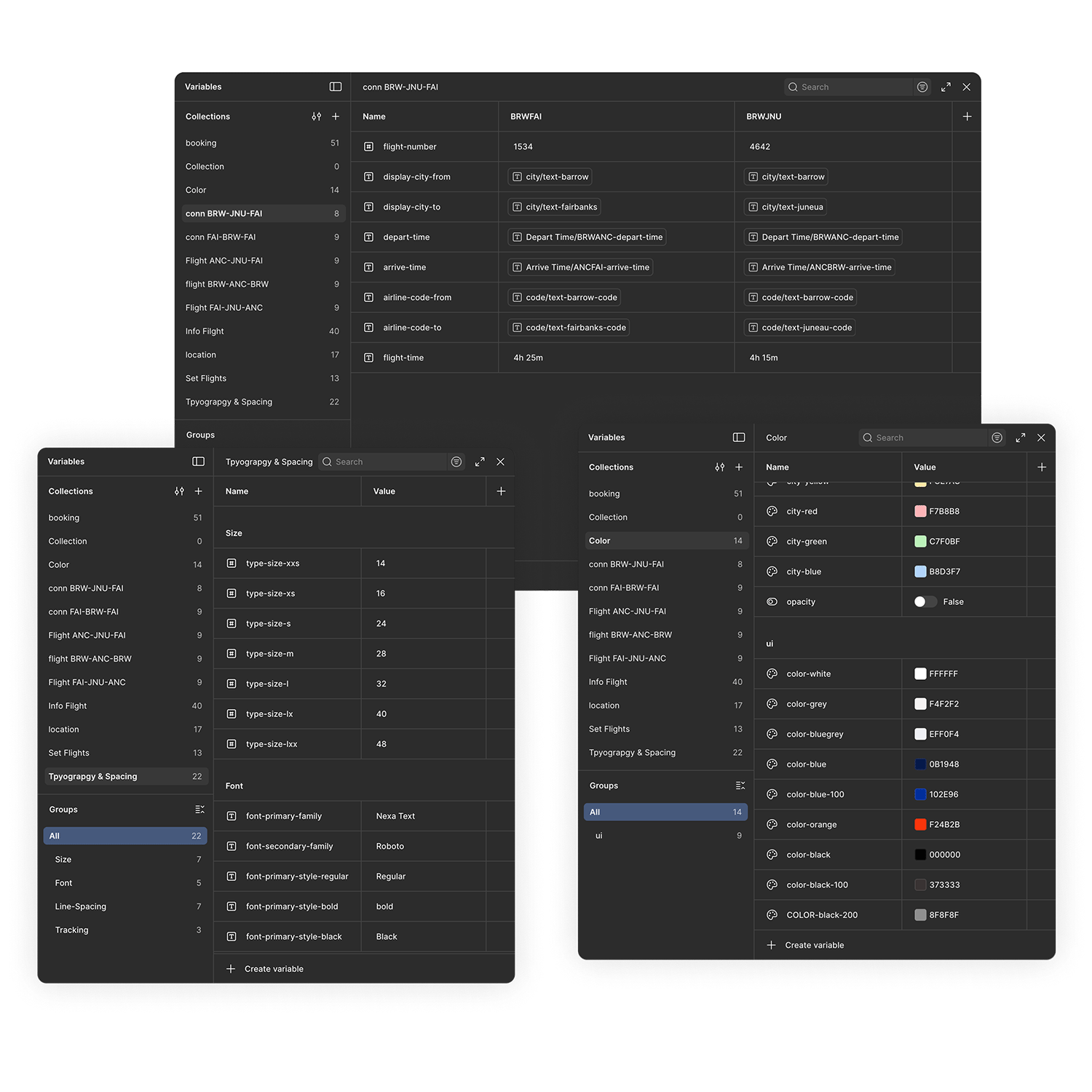
Figma Variables
All tokens like colors, type sizes, and flight schedules were stored as Figma Variables with clear naming conventions and locations, making them easy to understand and quickly locate.
Keys Takeaways
This is the longest period of time I have work a project. Having many high and low trying to figure out the best design layout. This project help me learn to have a higher understanding how to use variables and components. Overall, though the process to get here was difficult, it has help to grow as a designer.
Core takaway
Time management was a key issues. Give yourself enough time for project like these ones's.
Having a consistent design system help fast up the design process. Help you save time on parts of the process are more important.
When working on a big project, focus on the users’ needs and goals. Don’t overcomplicate the design and try to keep it simple and practical.