


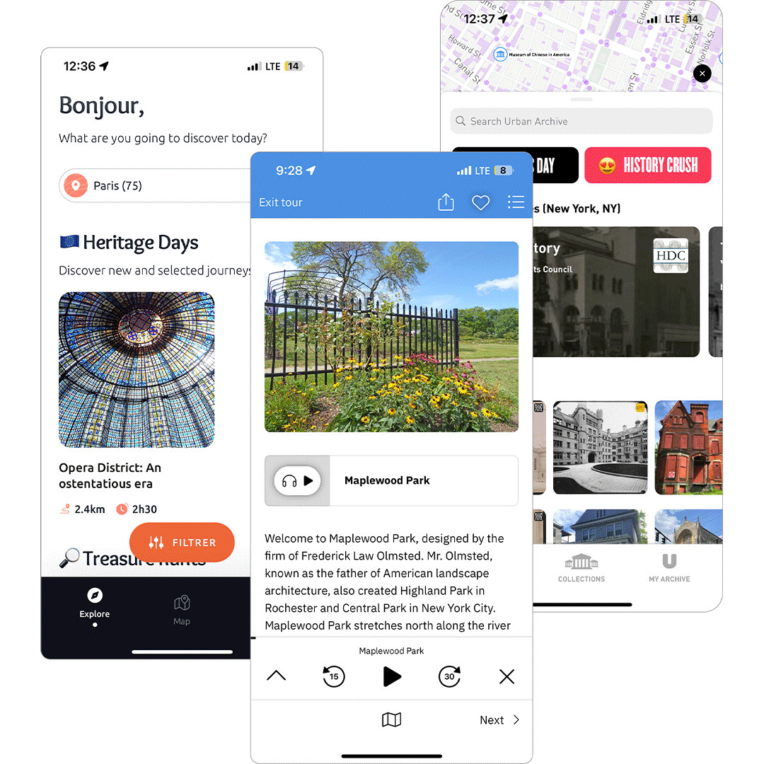
I search apps addressing similar challenges in city exploration. TourBlend excels at customization, while Urban Archive offers interactive maps with great historical content. By understanding their strengths and weaknesses, I identified opportunities to create a more engaging and well-rounded experience.


I conducted user interviews with 3 Rochester resident to understand the view point on a different experiences that draw them to city like audio tour, there goals when visiting the city, and what keeps them coming back to downtown.
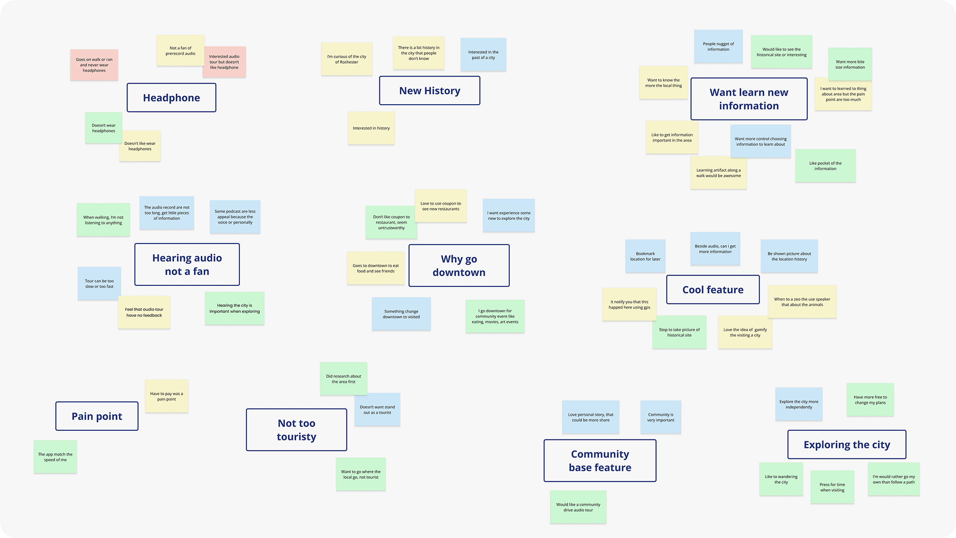
Use an affinity mapping to organize notes and quotes from the interviews.
Research insights and pattern that guided my design decisions:
"I always enjoy site seeing and learning new pocket of information about an area or building but getting that information can be inconvenient."
I interviewed three Rochester residents to understand what draws them to the city. We discussed their experiences with activities like audio tours, their goals when visiting downtown, and what keeps them coming back.
"I hesitate to use a city audio tour because I want to explore the city in my own pace and I also won't enjoy wearing headphone."
Participants expressed concerns about traditional audio tours limiting their experience. They wanted to avoid feeling locked into long, structured routes and valued the flexibility to explore Rochester on their own terms.

Many disliked using headphones while exploring. And also felt that the paces of tours are too rigid, they are either too fast or too slow.
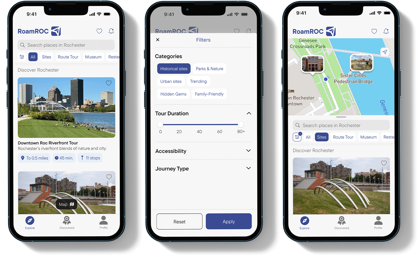
Focus on highlighting key city spots with clear navigation. Make learning about the city more engaging and interactive.
Use AR features to bring history to life with visual overlays. Making exploring rewarding to encourage visitors to come back to the city.
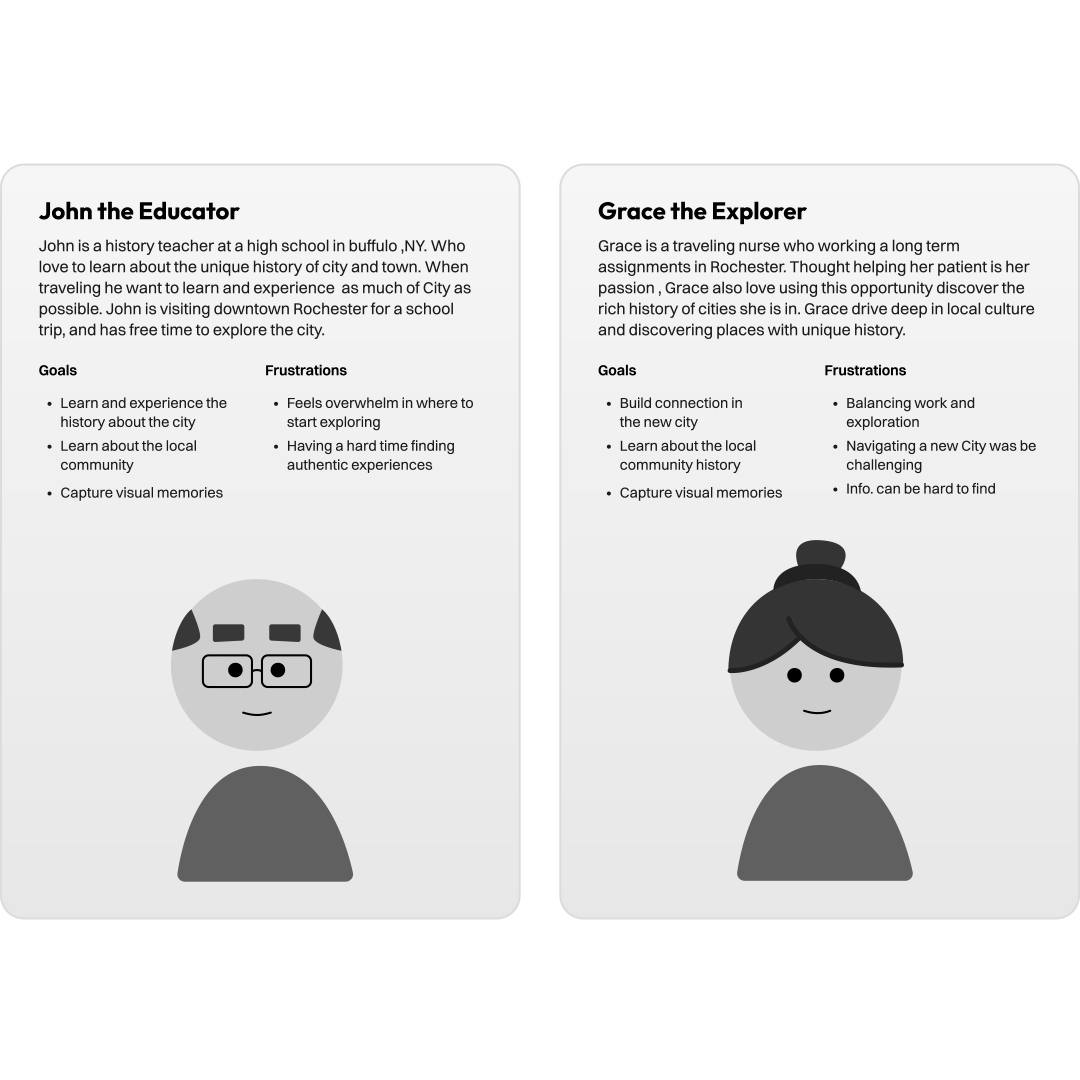
I selected the personas' age range to be between 26 and 40,as my previous research shows that this demographic is the most likely to seek out and try these types of experiences.
My solution focus on creating a simple experience that make finding these interesting stories of the city easier. The experience will be using the smartphone as it is a common device to have when traveling. This is providing more than just finding these locations like Google but also gives a depth history in how is it significant for the city.
Base on the research, it was decide to have users browse different city location and have map feature find set location. So the iteration phase started by sketching different various to find the right layout and user flow.
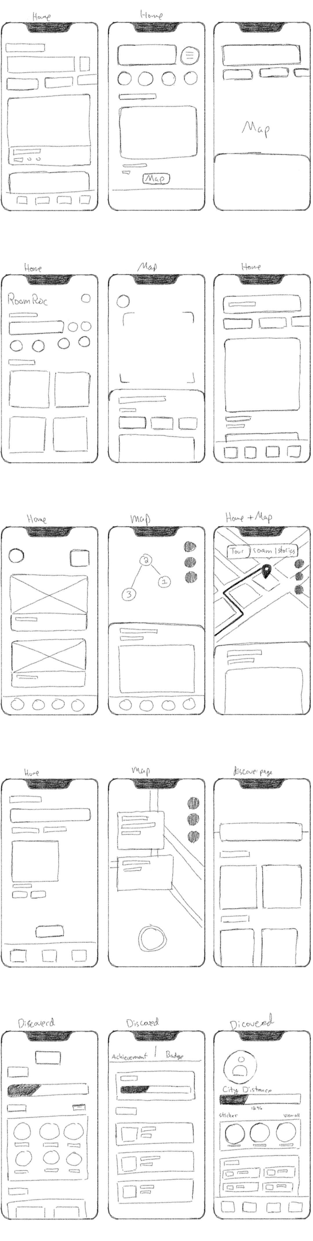
After making a good amount of sketches, I tested the designs In Figma to see if they work in the digital formate. The lo-fi phase was mainly use to test how if all the location should be shown all a once or they have scroll down to see all location.
After many iteration, the direction of having users scroll down through different location was best path for the experience. The reason is that Rochester has dozen interest hot stops, so trying stuff all this place in small screen would be difficult. With the scroll function each element will have extra size to have photo, location names and description.
The main place that need more work is how the user will be shown the location each hot spot. Through only in lo-fi phase, all the UI need to be improve and clean up.
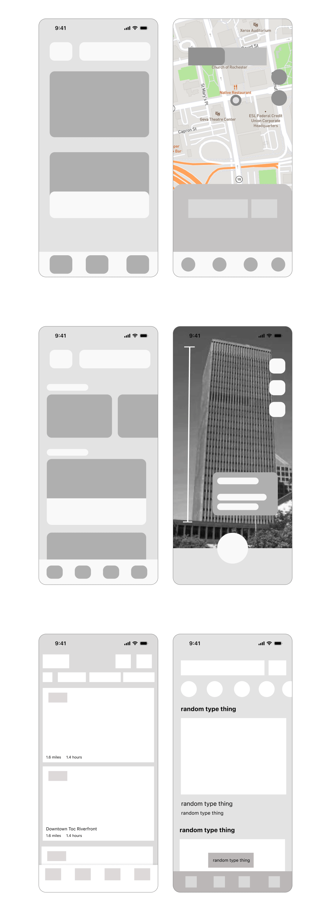
The goal to figure out how all the UI element will look and feel. This part of process use more detail elements and type to illustration how how features will work and feel.
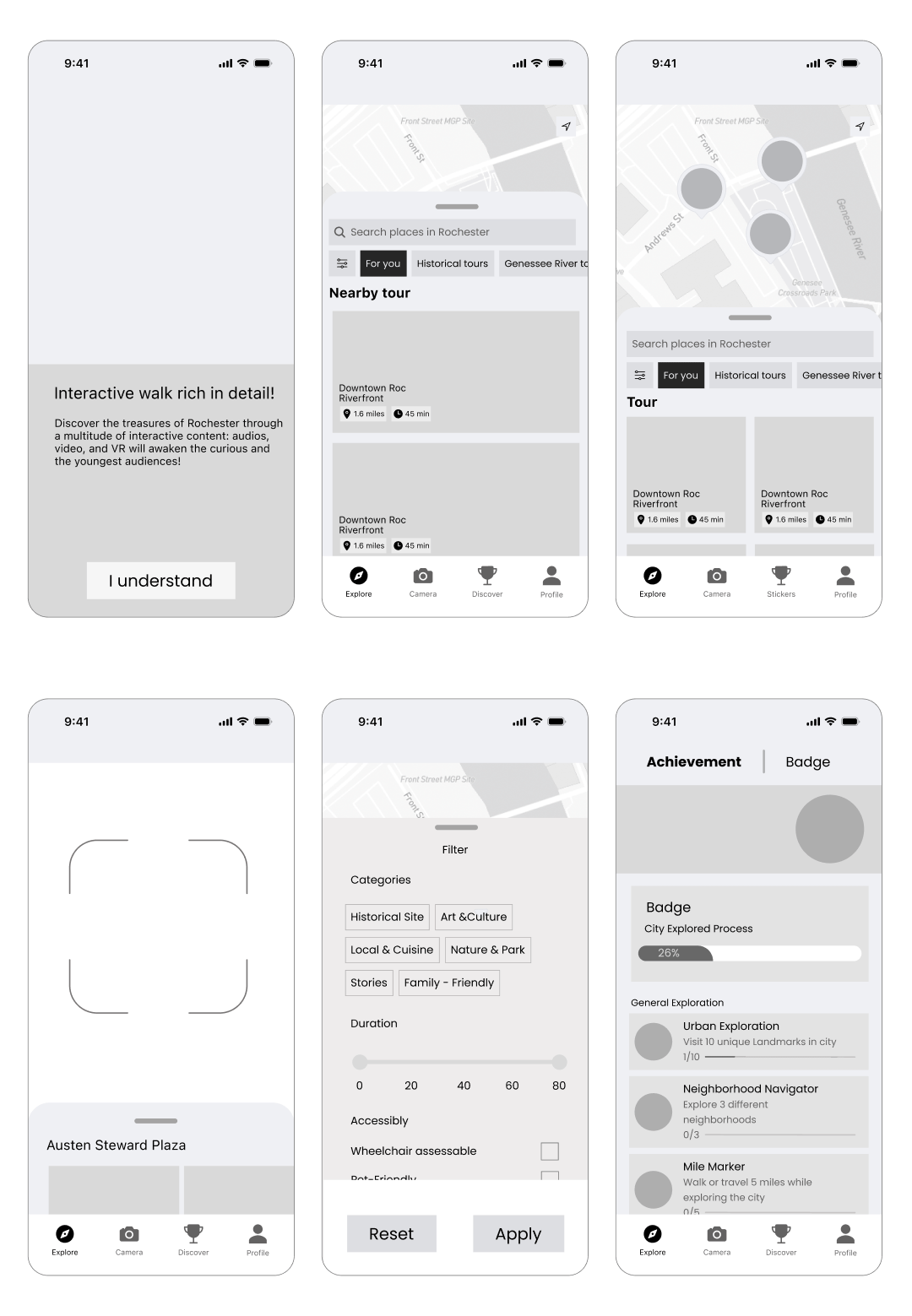
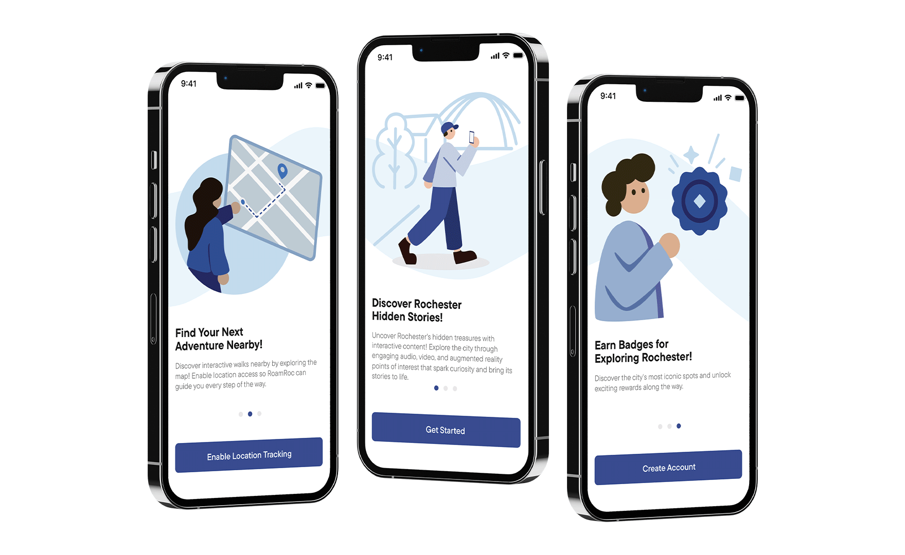
In the first iteration, the goal was to map out the user flow. The experience starts with a short onboarding sequence that leads to the home screen. Users can view hotspots on the map screen and use filters to customize their feed. Each location includes detailed historical information. To make learning about Rochester more interesting, I explored adding AR features and challenges.
Overall, the second iteration was visual improve all UI elements with better type and spacing. The biggest chance was the combining of the location screen and map screen for better user flow.
I chose a blue color palette to align with Rochester's city branding, which features a blue flower in its logo. Since Rochester is known for its rivers, I incorporated river imagery and blue tones throughout the design. For typography, I selected TT Commons Pro, a geometric font that's both modern and highly readable
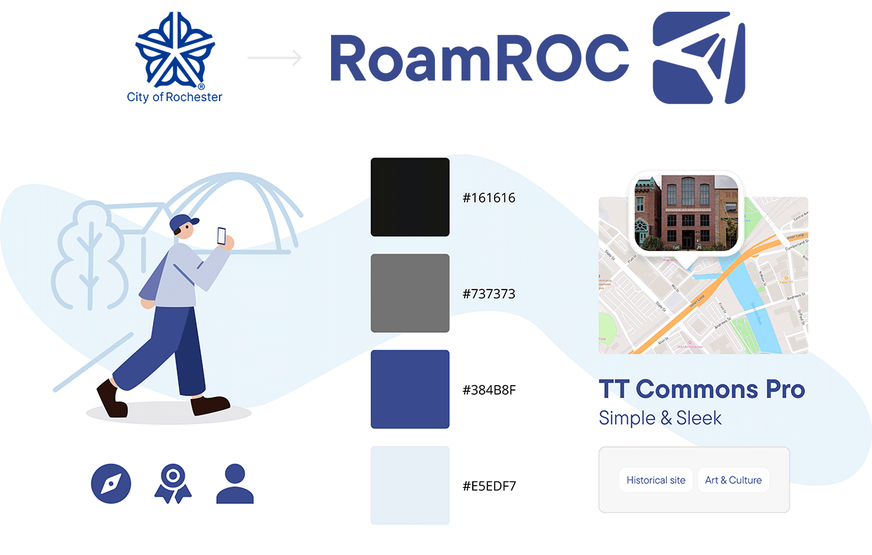
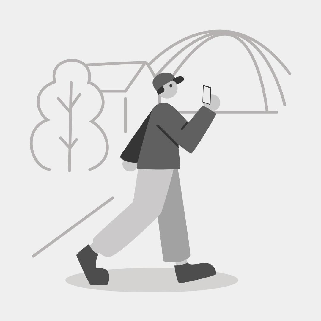
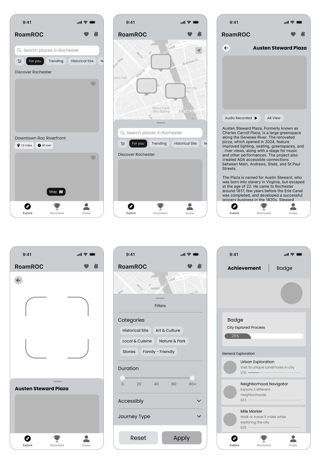
RoamRoc is an app designed to make exploring Rochester exciting and effortless. I wanted to create an engaging experience that encourages people to return, discover more, and immerse themselves in the downtown. RoamRoc offers a fun and enjoyable way to experience everything Rochester has to offer.
Your interests, your journey. Filter through topics that intrigue you or wander the map to stumble upon Rochester's secrets near you.
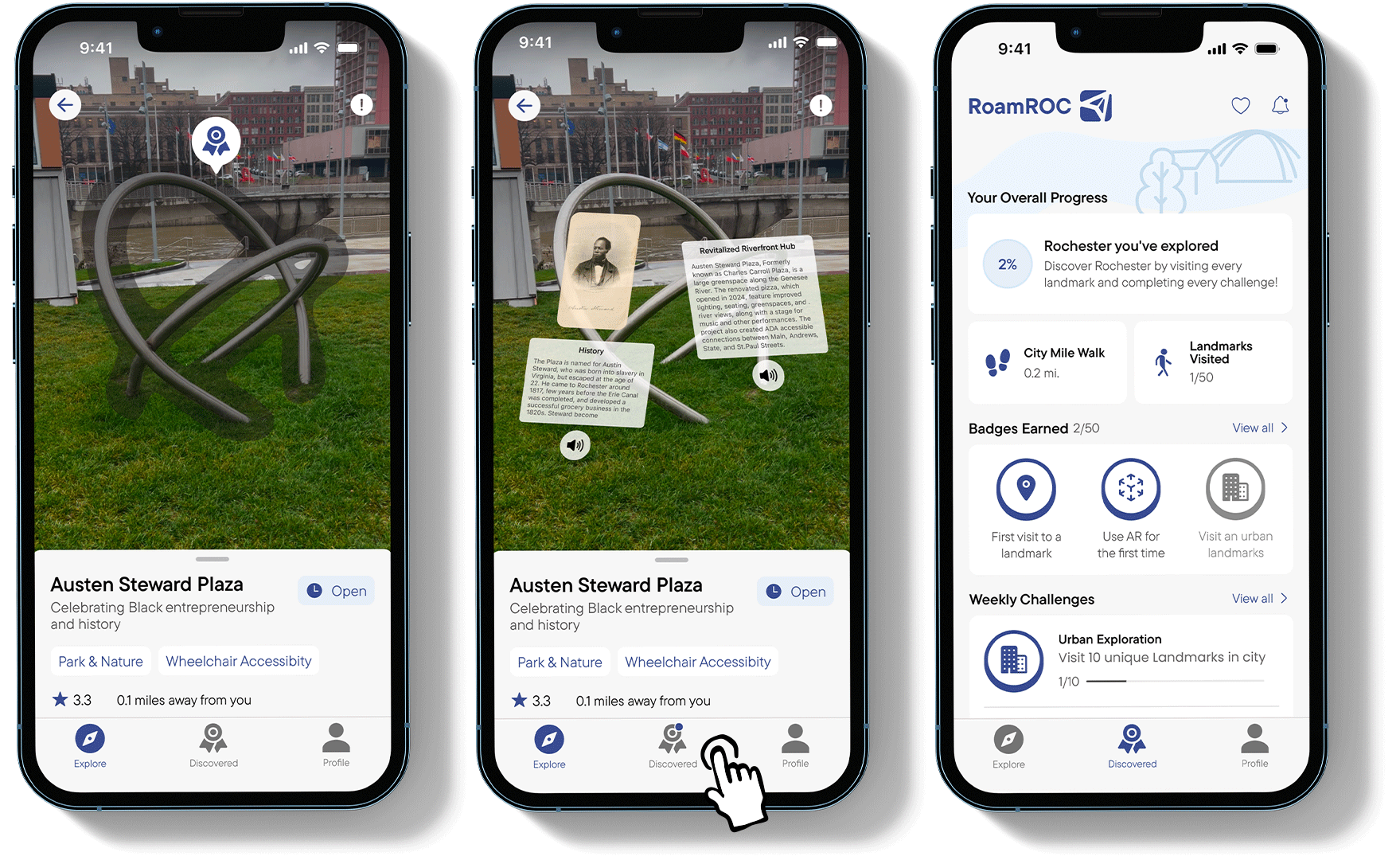
Discover why each location matters. Every hotspot comes with a full breakdown of its historical significance and impact on Rochester. Since many users would be experiencing AR for the first time, I included safety warnings to remind them to stay aware of their surroundings.
I also created a brief tutorial to help them understand the feature and how use it properly.
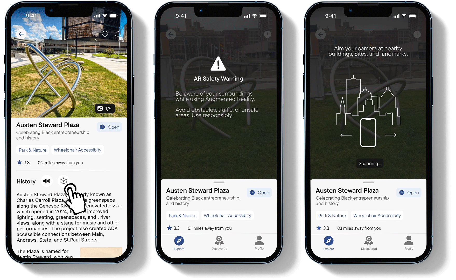
Experience history through AR at every stop. Listen or read to stories that reveal interesting details about the area's past.
Earn badges as you visit locations around Rochester. By signing up, users can save their progress exploring the city. There will be weekly and monthly challenges that encourage users to visit lesser know area of the city.

I learned to conduct and understand data from user interviews to explore different users cases.

Spending too much time on the initial screens left less time to refine later features. Managing time effectively is key to making sure every part of the app is polished.

Adding illustrations to the onboarding process made the features more intuitive for new users, showing the value of visual aids.