TN Wallet is a mobile app that lets Tennessee residents store and manage their important state documents in one place. It was built for people who struggle to get to a government office, giving them a simple way to apply for and access their documentation right from home.
The Mission
Access for every Tennessean
For too many Tennessee residents, getting their documents means sitting in long lines, dealing with confusing processes, and taking time out of an already busy day. For those folks without reliable transportation, that trip to the DMV or gov Office is an experience that is not just frustrating but sometimes impossible..
How do we make it easier for Tennessee residents to get their state documents without having to deal with everything that makes government offices so frustrating?
Research breakdown
Because of the project timeline, the research leaned heavily on secondary methods like articles, public forums, competitor analysis, and heuristic evaluations. This helped identify the most common frustrations people run into when dealing with the DMV or other state offices, which guided the design decisions for TN Wallet.
Main Insight
Getting round Tennessee isn't easy for everyone
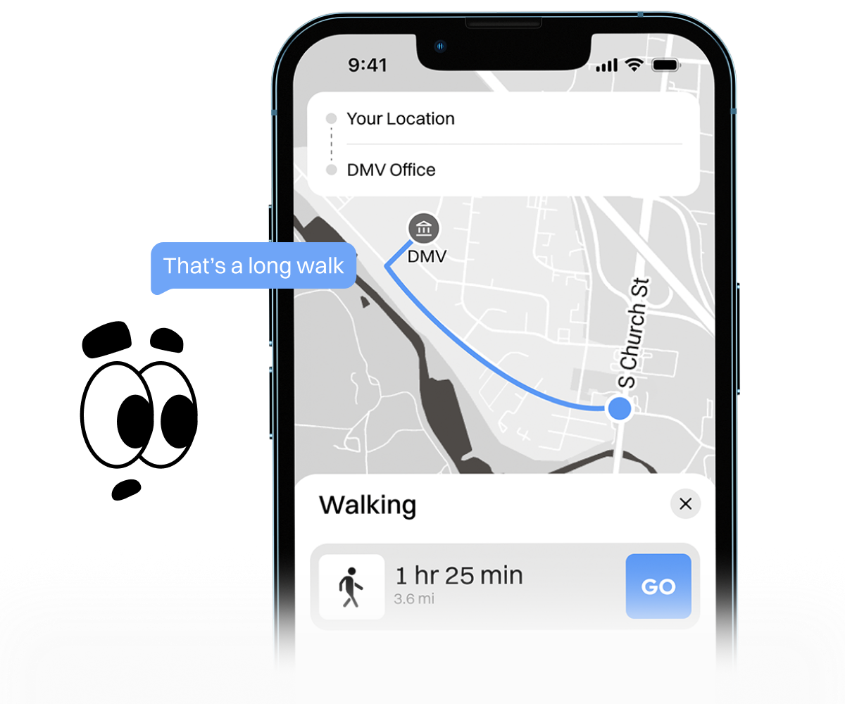
Tennessee is one of the worst states in the country for public transportation. Research shows that outside a few urban centers, most residents have little access to transit that actually works for them, and in rural counties, the options are nearly nonexistent.
Resulting in ...
People without cars still have to find a way to travel long distances just to pick up basic documents.
Ask someone in rural Tennessee how they handle a trip to the DMV or a government office without a car, and you'll quickly realize it's rarely simple. With little to no public transit connecting there towns, even the most basic trip can mean finding a ride, burning a day off work, or just going without.
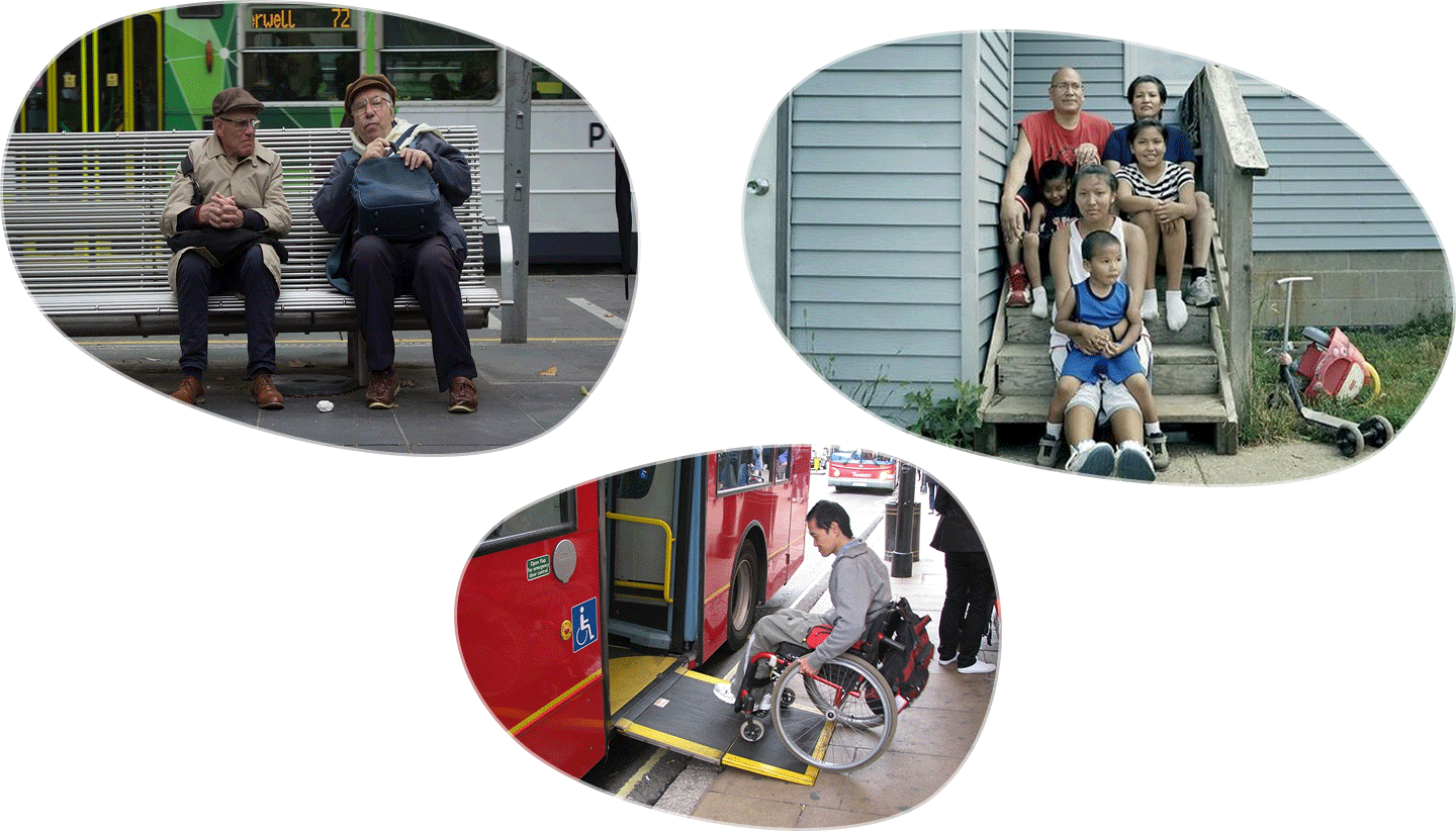
The people hurt most by this...
Are the elderly, those living with disabilities, and low-income families.
The research was focused on understanding who is hit hardest by the current system. Rural households kept coming up, as they are three times more likely to be without a car than non-rural households. And it does not stop there, 8 in 10 non-drivers with a disability show that they can’t get to the places they need to go because of lack of transportation .
Post-Research Problem Statement
People without cars still have to find a way to travel long distances just to pick up basic documents.
How Might We…
Ditch the long Lines
For too many Tennesseans, a trip to the state office means long waits, confusing steps, and a whole lot of wasted time. We can do better.
Concept Proposal
Scan and submit documents from home
Upload your documents, track your application, and get your license or permit without ever leaving the house. Everything you need, in one place, on your phone.
Ideas to reality
Final Deliverables
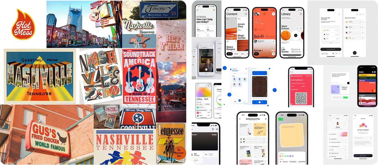
Visually an Tennessee Moodboard
To kick off the design, two mood boards were put together. One was rooted in Tennessee's identity, and the other explored what's working in UI design today.
Aligning with TN visual identity
A custom pattern was designed where each tile represents something renowned to Tennessee, a tomato for the state fruit, a guitar for Nashville's country music roots, and other details that nod to the state's culture.
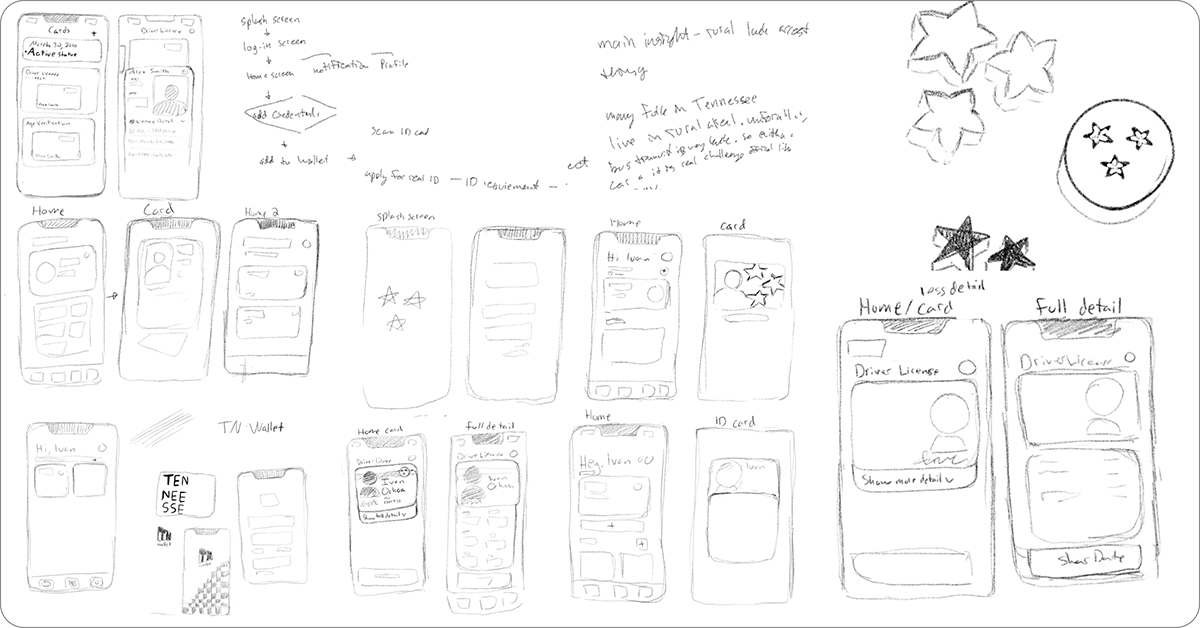
brainstorming user-flow and wireframe
Before settling on a direction, a few different approaches were explored to find what worked best for users. It started with rough sketches and user flows, then moved into low fidelity wireframes to put the ideas to the test.
Beginning User flow
The first version of the flow kept things simple. Users added their ID, permits, and other documents to the app from the home screen, and could use their digital license or ID right from their phone. Sharing information with others was one of the new features included with the digital license and ID.
The problem was, this flow didn't really address what users needed most
Add a big change to the user flow
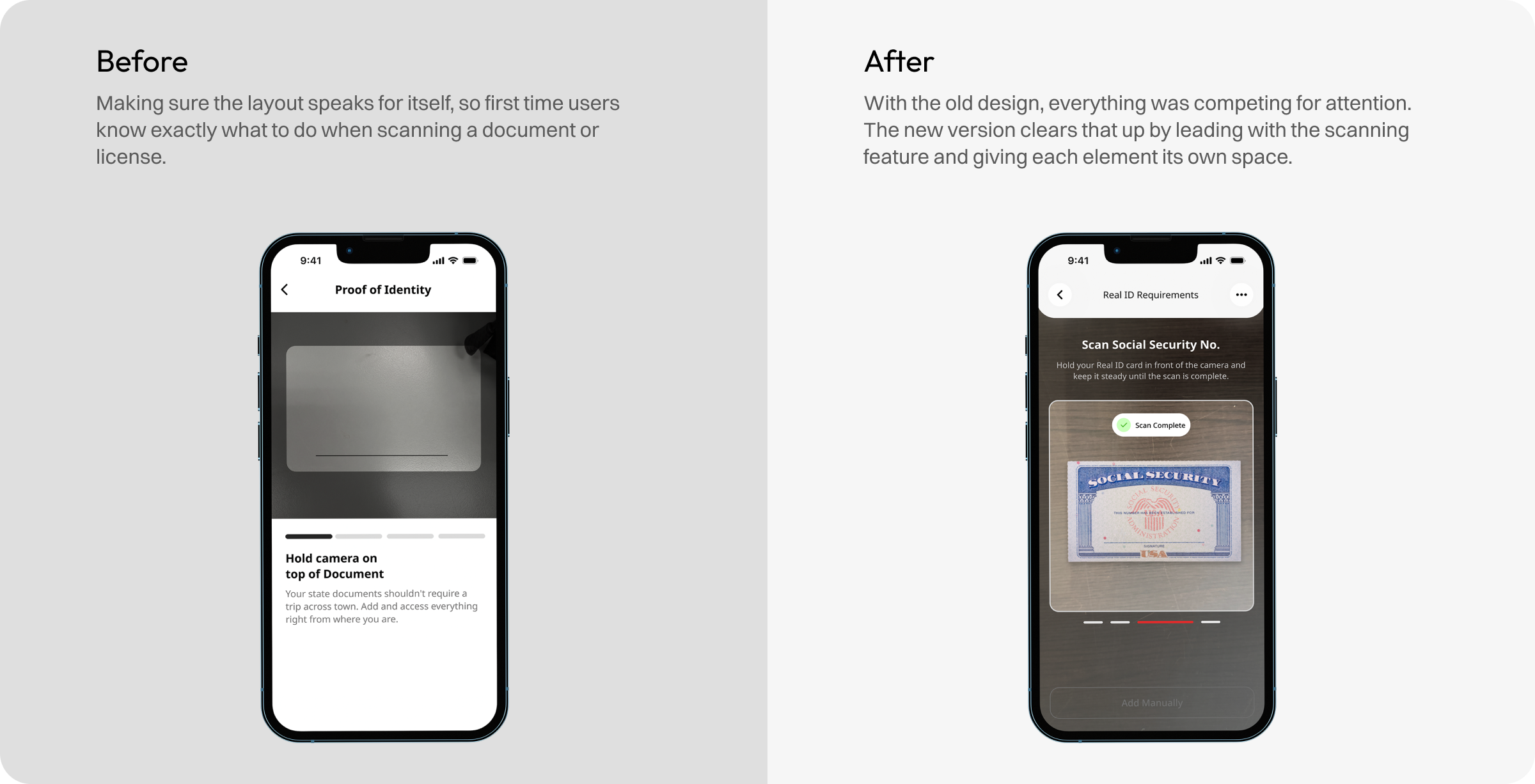
I took a step back and went back into the research to look for pain points that weren't showing up in the first flow. What I found was a group of people who face real barriers just getting to a government office. That pushed me to rethink the flow and add a scanning feature, putting the whole process in the comfort of their home.
Finding out what works and what needs fixing.
Based on what users shared, changes were made to improve the flow and tighten up the layout.
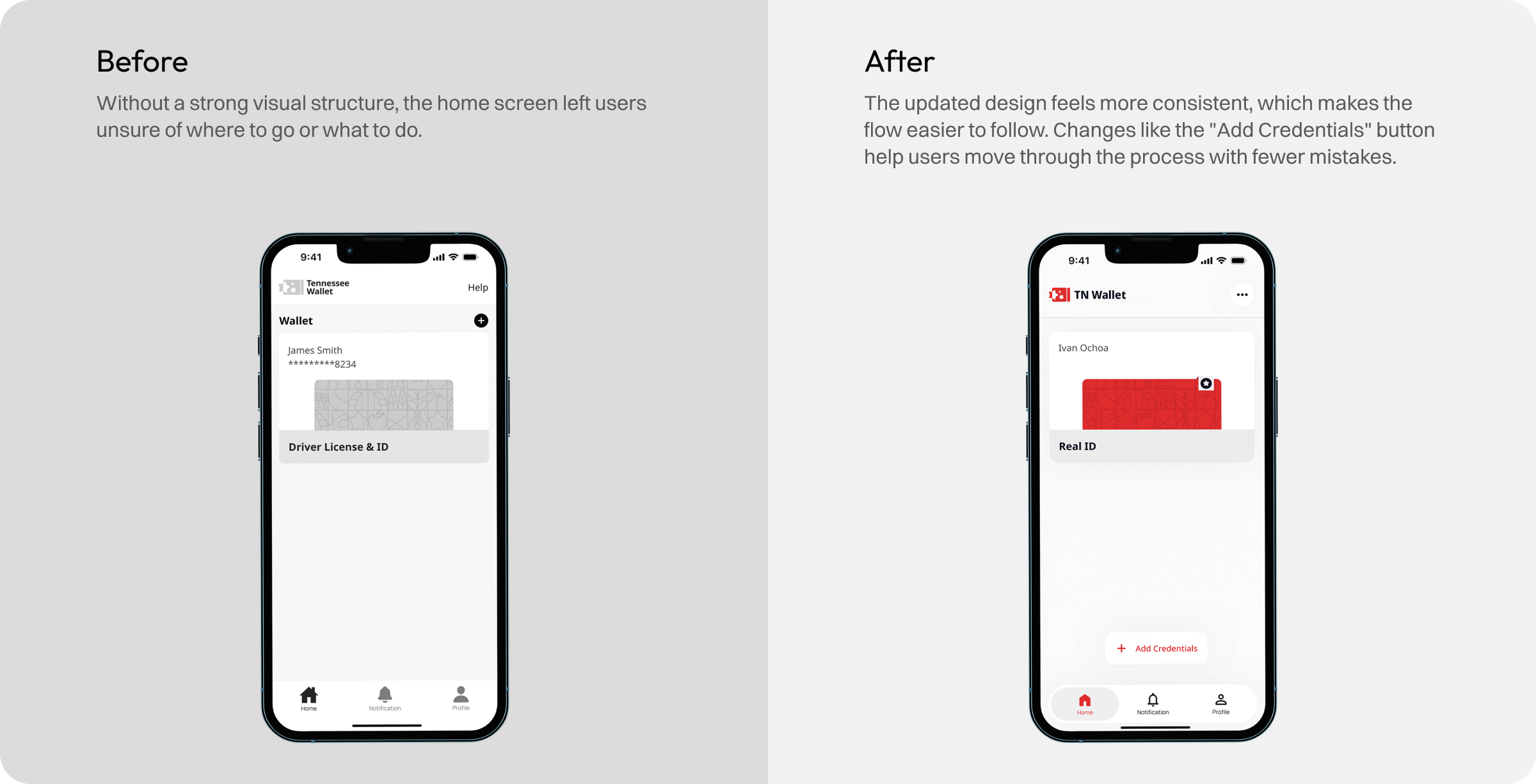
Final design
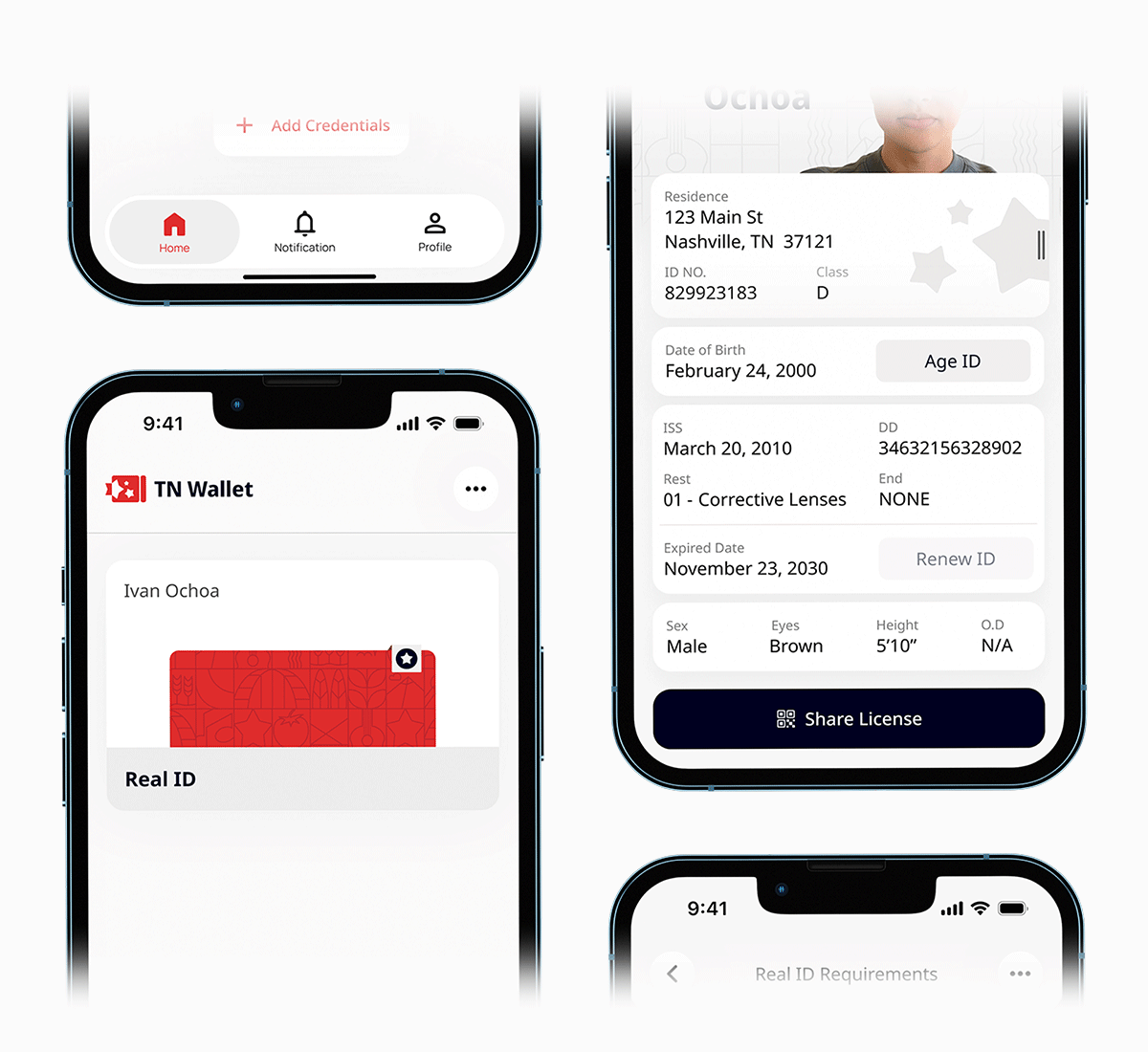
Hold all your documents in the palm of your hand
Most people carry their phone everywhere. TN Wallet replaces the documents sitting in your wallet or purse with a single app.
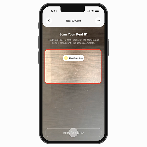
Apply and renew any TN document from your home
Apply for and renew licenses and permits without leaving your house. Your personal information stays protected every step of the way.
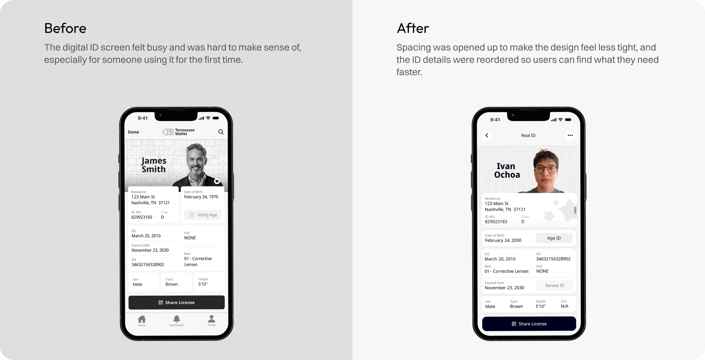
Hold valid license and ID on your device
Find what you need at a glance with organized, sectioned layouts. Verify your license is real with a tap. Confirm your age through Face ID. Generate a QR code that shares only the details you pick, and keep a running record of who has seen your information.
Learnings & Impact
Project Takeaway
The design process is not linear
When I started this project, I followed a familiar design process like the double diamond. But working through it taught me that real projects rarely follow a straight line.
Iterations is key
For projects like this, the first designs are almost never good. But each iteration pushed the work further, and the more I designed, the better it got.