Forever Changing How You Drive

Overview

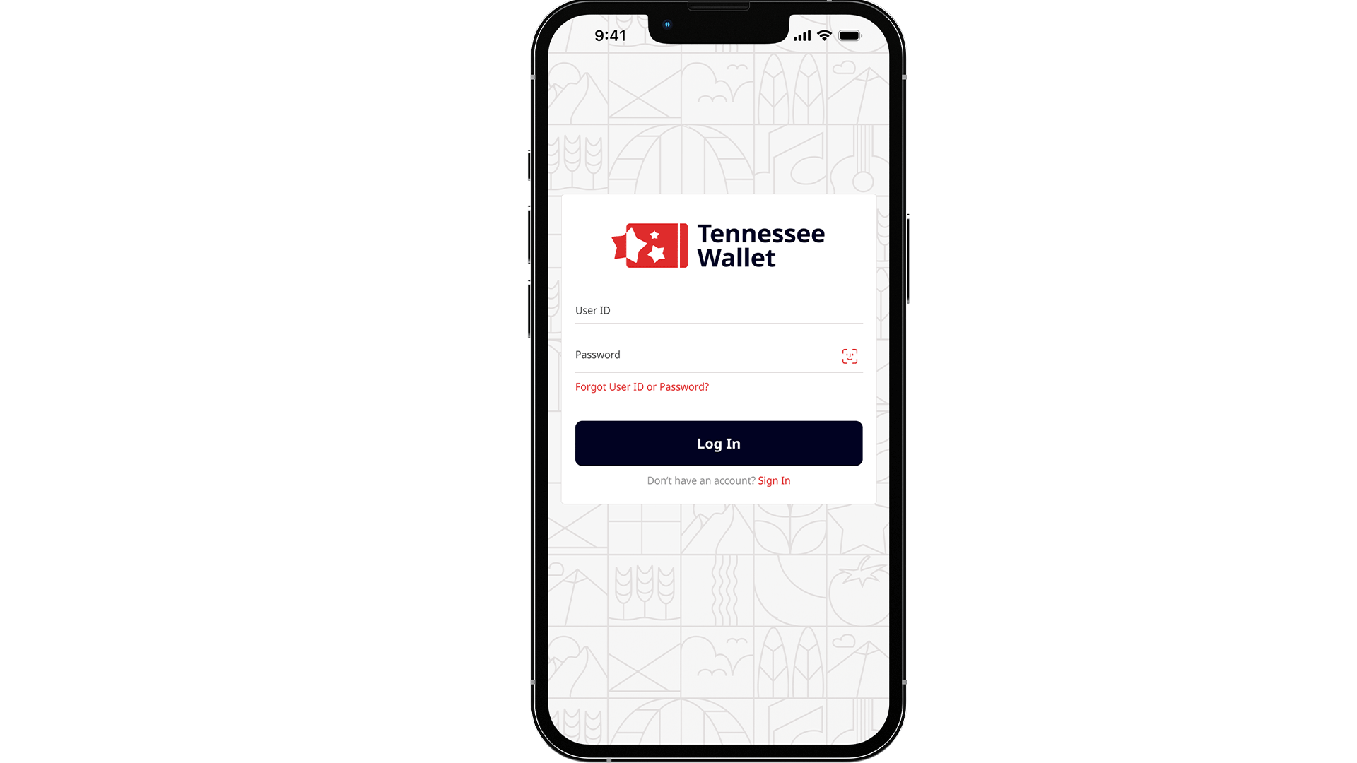
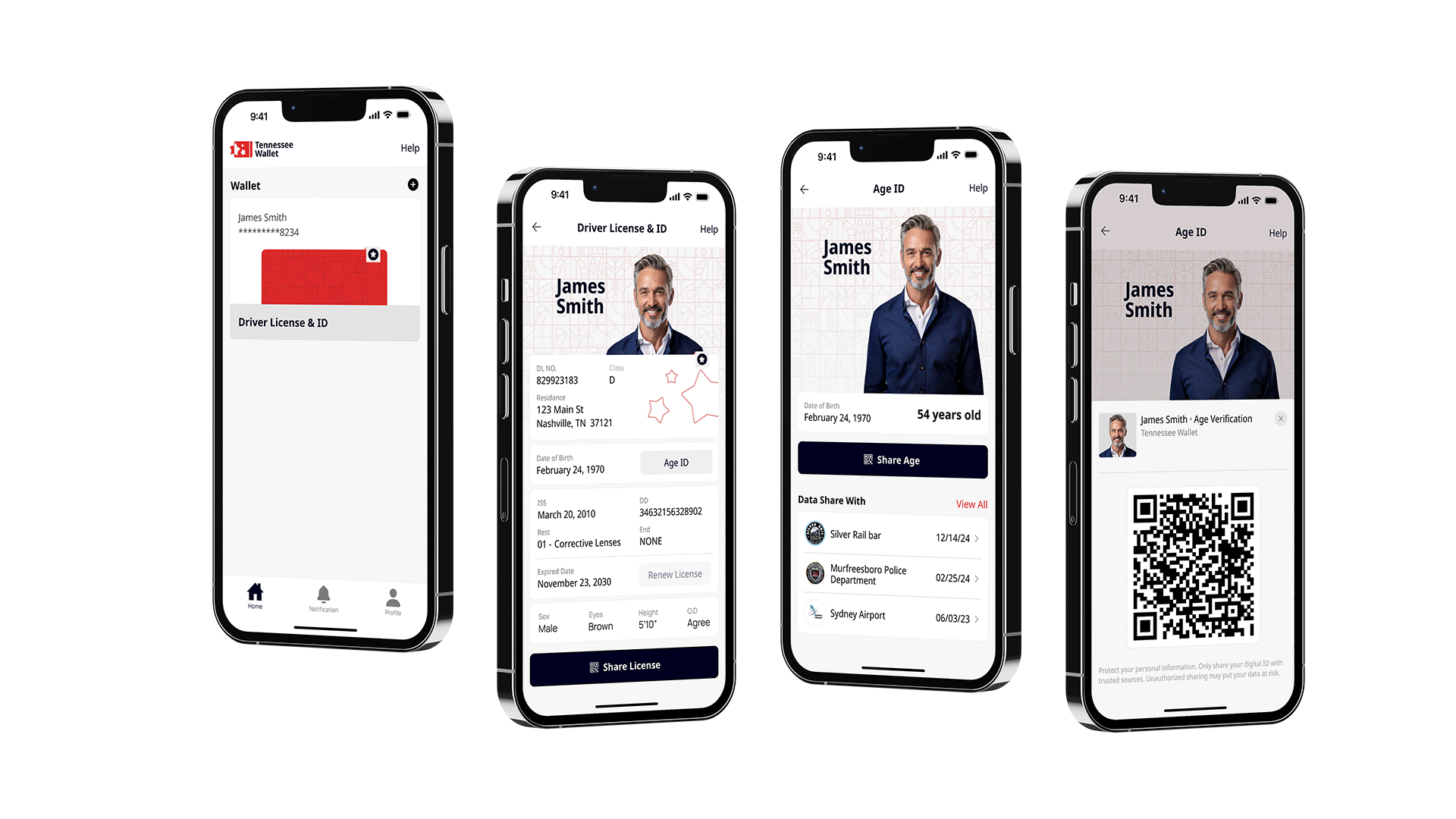
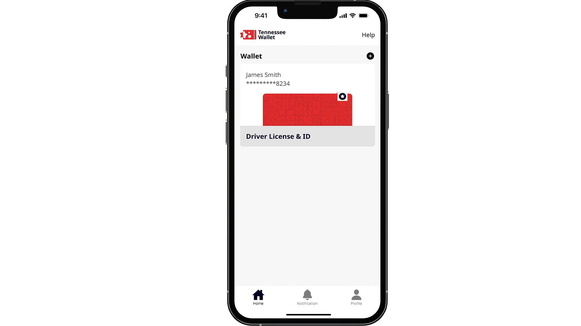
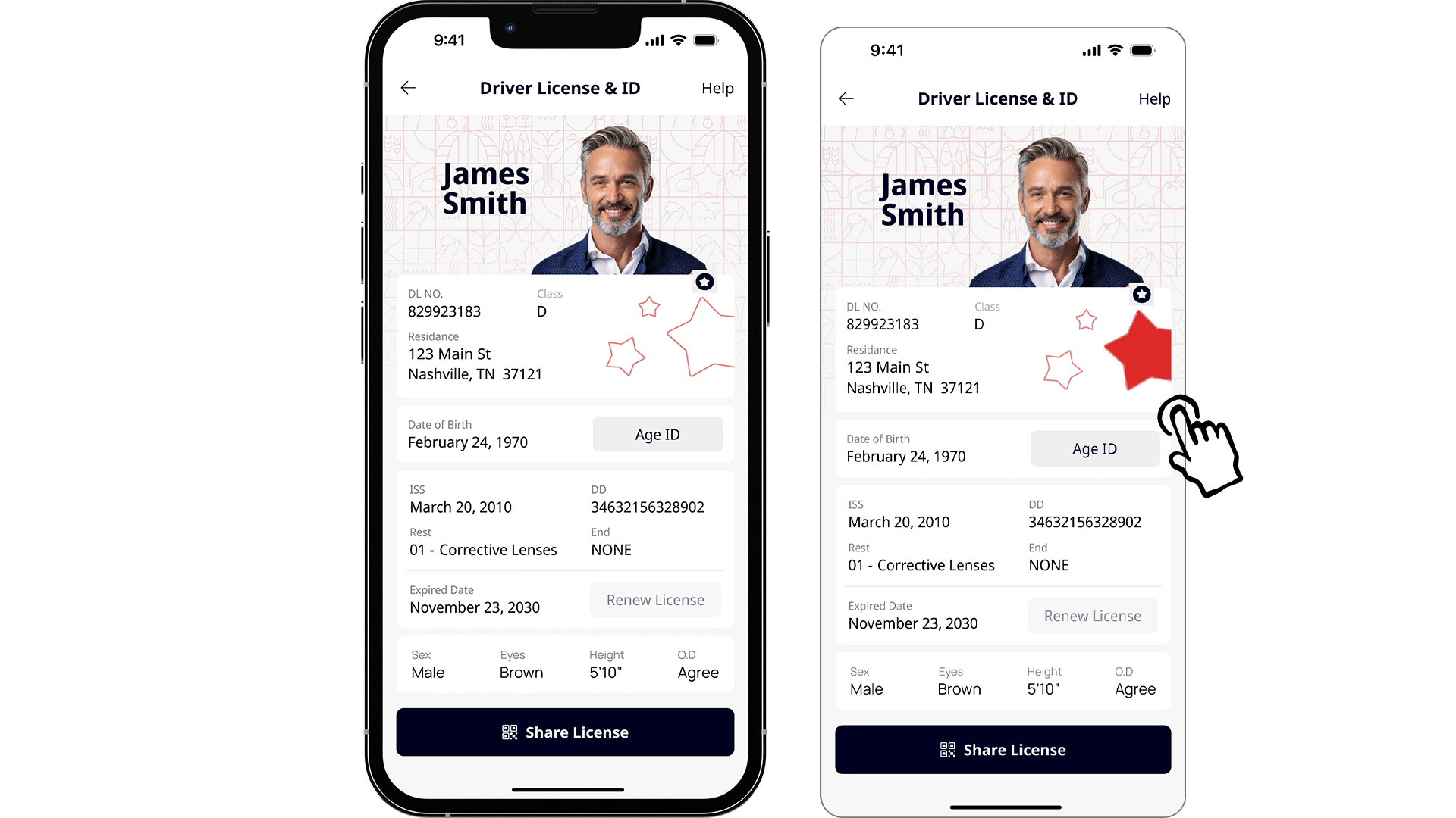
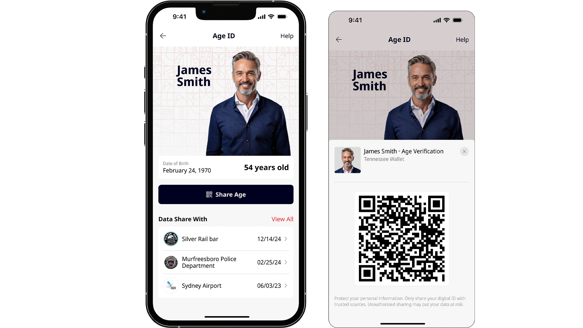
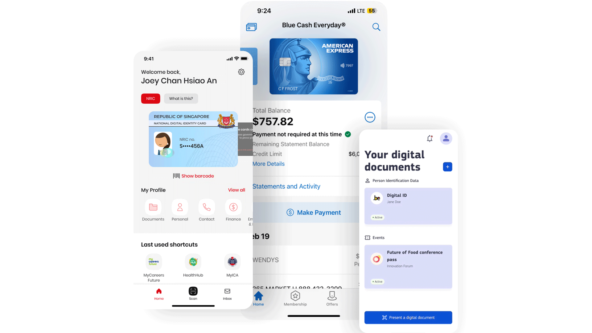
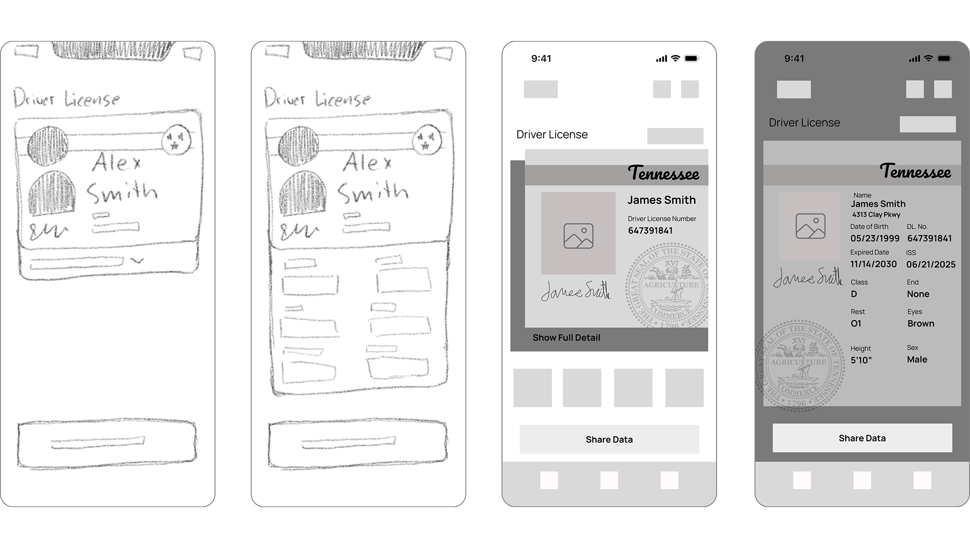
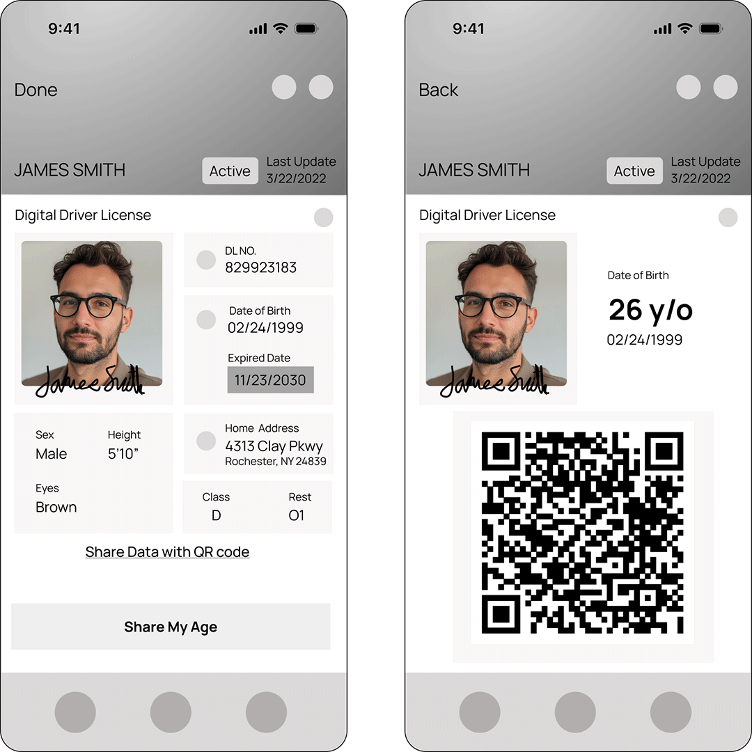
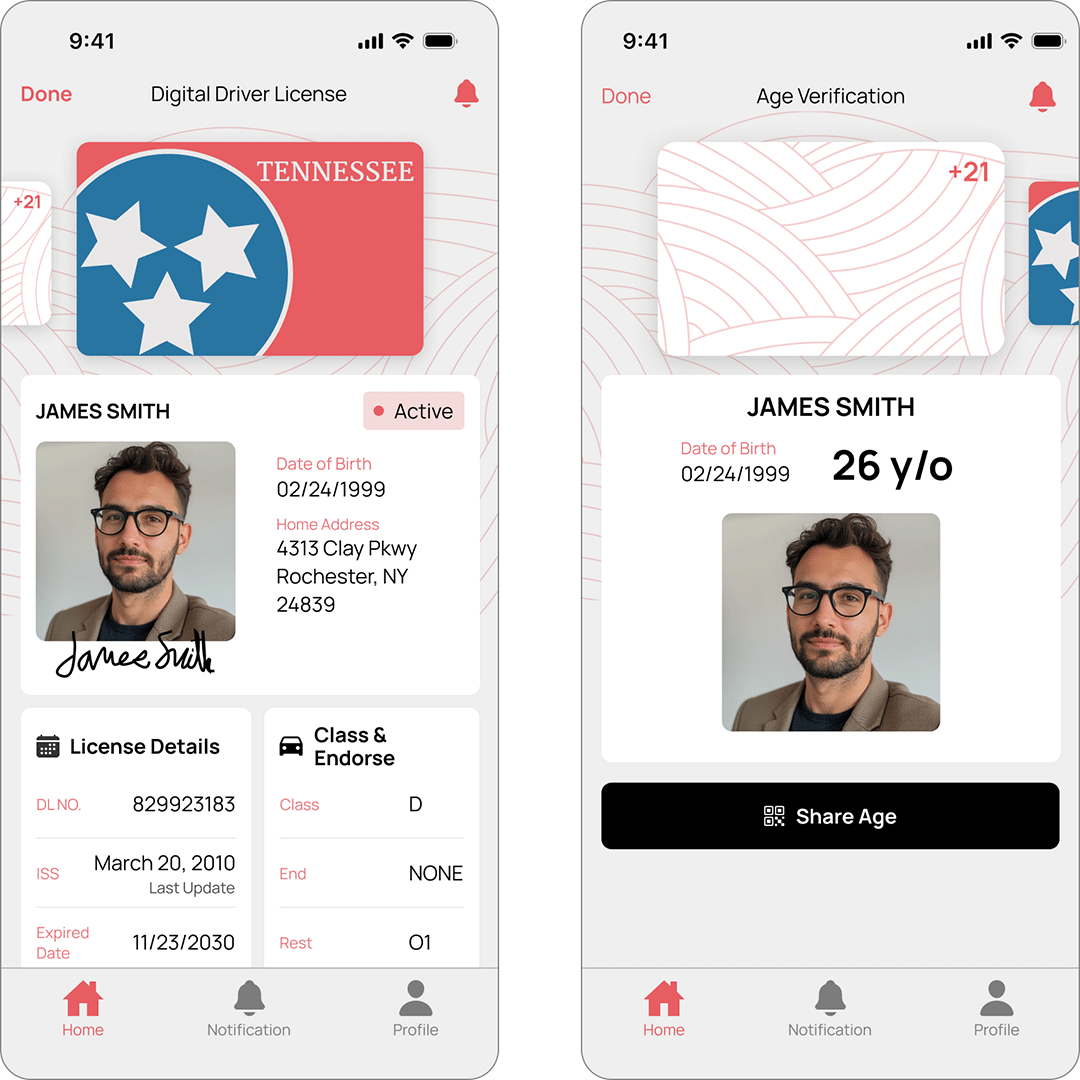
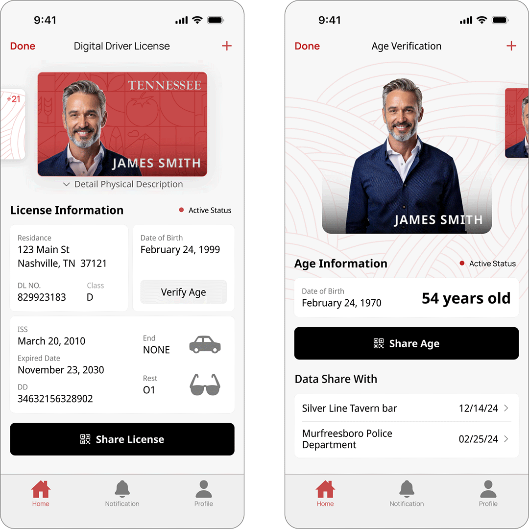
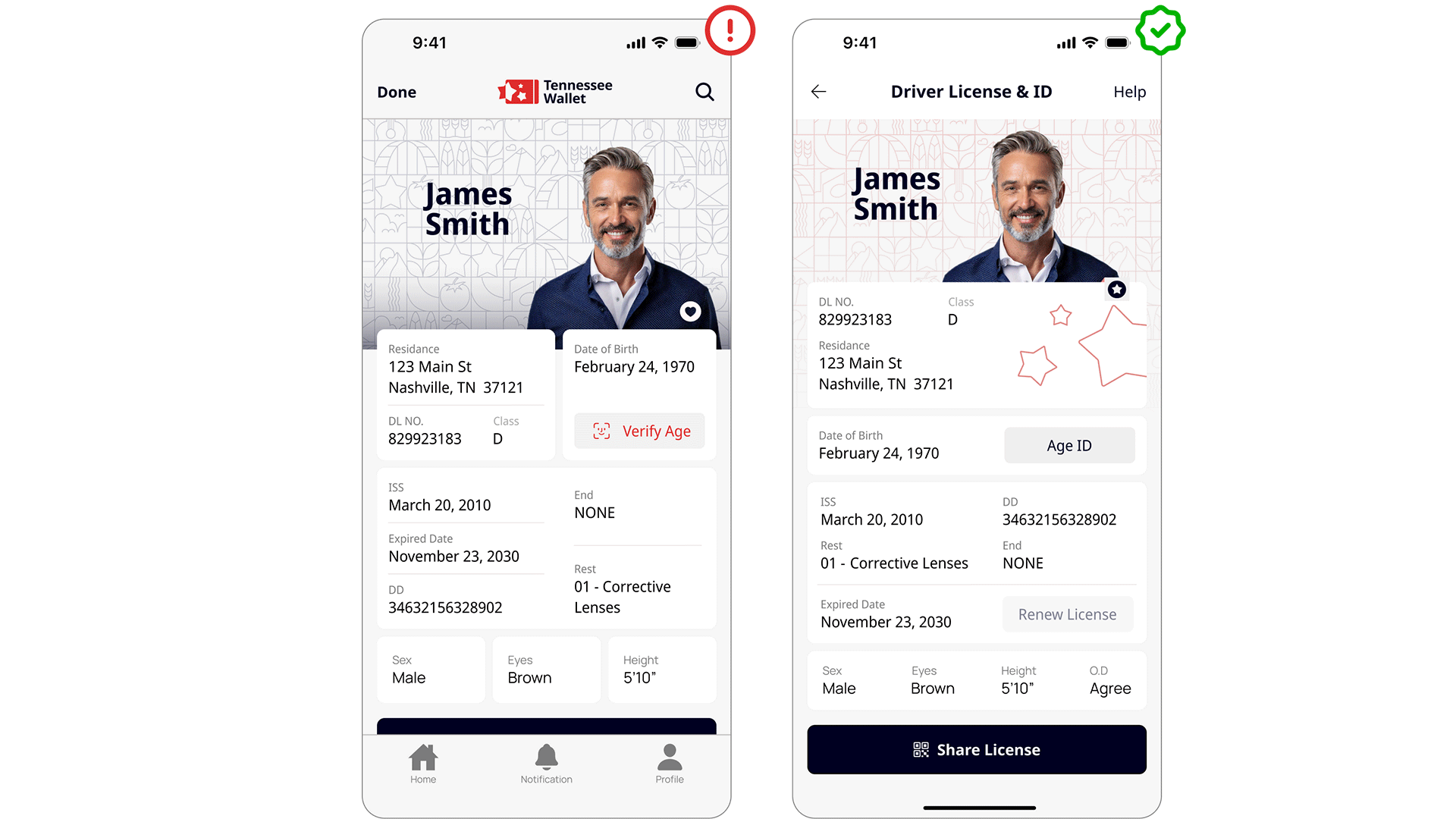
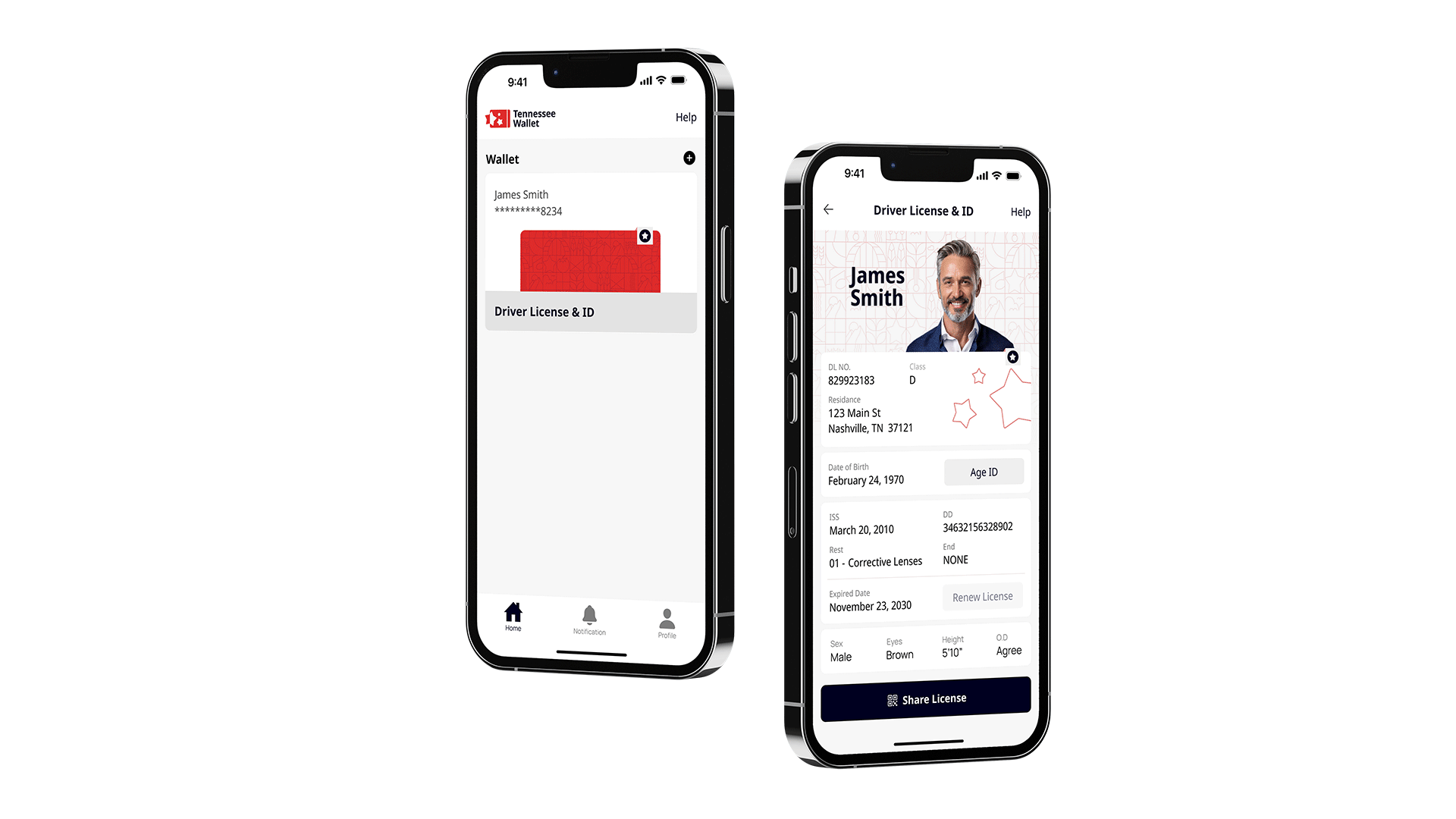
We still need physical IDs to drive and verify identity, but forgetting your wallet means risking a ticket. These small cards hold limited information and feel outdated. What if Tennessee had a digital solution?

Roles
Researcher
UX/UI designer
Illustrator
Timeline
Nov - Dec 2025
Tools
Figma
Illustrator
The Problem

Physical Licenses have Poor Readability & Outdated

License layouts are cluttered and confusing. Finding specific information means scanning through cramped text, and sharing your details? That's a slow, manual process every time.

Our Physical license/ID seem to Disappear at Worse Times

Physical licenses are easy to forget and even easier to lose. One misplaced wallet, and you're without your ID.

"What if there was an way to use a digital experience to reimagine how to carry identification?"

Project Goals

Visual Layout

Design a sleek layouts & brand that promote the feeling of reliability & the state values.

Redesign the License

Reorganize the physical license layout for a digital layout. Improve the License scan-ability & hierarchy of the information.

Shareable & Security

Add features that make sharing ID data easier & safer. Easily verify your information like date of birth.

Solution

Tennessee Wallet

We live in a digital world, where practically everyone has a smart device with them at all times. Smart devices have become a one-stop shop for holding important information. I redesigned and improved the Tennessee state ID/driver's license for a digital wallet.

Solution

A Simple but Impactful Branding & Layout

I kept the design simple with a clean color scheme and flat layout, making it easy for anyone to use. The modern look helps build confidence that the app can handle personal data securely. The logo and pattern? They're there to keep Tennessee's identity front and center.

Solution

Reorganizing Iicense Information for Easilier Access

The license information was divided into modular, bento box–style sections to improve scalability. The three stars on the right indicate a tap gesture used to verify that the license is authentic. Easily display only the information that the user wants to share.

Final

Easily Share License Information with Confidence

Verify age through Apple's Face ID for secure, contactless confirmation. Share information via generated QR codes that contain only what you choose. Track every access to your license data, so you always know who's viewed your information.

My Approach

Lo-fi Ideation
Competitive Analysis
Hi-fi Ideation
Branding
Competitive Analysis

Learning from the Competition

Singpass, the EU Digital Identity Wallet, and the American Express app each show strengths in convenience, hierarchy, customization, or branding, while still needing improvements in visual clarity or design consistency. All three highlight the importance of intuitive navigation and trustworthy visual presentation. Overall, they balance usability and security but differ in how effectively they present information.

Key insights:

Clear hierarchy and simple navigation matter.

Clean and clear layouts build trust with users.

Using the familiar ID card shape connect physical and digital experiences.

Ideation

Struggling to Reorganize Information

My beginning sketches explored different ways to reorder license information for improved readability. However, I quickly hit a wall. Rearranging the information was harder than anticipated. Each layout felt clunky and unfocused, lacking clear hierarchy or visual flow.

My "aha moment"

Finding Structure Through Bento Grids

The answer was bento boxes. Applying this modular grid approach to the ID layout suddenly made everything click. Each piece of information got its own defined space, creating natural hierarchy and flow.

Testing What Works

The bento grid felt right, but making it work was another story. ID information did't play nice. You've got short bits like dates next to long strings like addresses. Getting everything to look balanced and stay readable meant a lot of back and forth.

Iteration 1 - Lo-fi Wireframes

I began by organizing all license details into bento grid compartments. Quickly, I realized balancing these elements would be more difficult than expected.

Iteration 2 - Hi-fi Wireframes

reorganized the license details to create better hierarchy, then began testing card shapes, colors, and patterns to refine the visual design.

Iteration 3 - Hi-fi Wireframes

I reorganized the license details yet again because the layout still felt unbalanced. Unfortunately, this new version lacked also good visual flow.

User Feedback

Redesign the License for the Last Time

Four iterations in, I thought I had it. The layout looked good and flowed well. Then I got feedback: it still felt a bit awkward. Back to the drawing board. I simplified the bento grid structure and added an interactive star for security.

Creating a Branding

Aligning with Tennessee Visual Identity

To connect the design to Tennessee, I chose red from the state flag as the primary color. I created a custom pattern where each tile represents something iconic to the state: a tomato for the state fruit, a guitar for Nashville's country music heritage, and other elements that celebrate Tennessee's identity.

Learnings & Impact

Project Takeaway

Making the Grid Work with Real Data

I had my bento grid structure, but real ID information tested its limits. Names, addresses, and numbers come in unpredictable lengths. A grid that worked for short content broke with longer strings. Through iteration, I developed a flexible system that adapted to content variation while preserving clean hierarchy and readability.